Fion
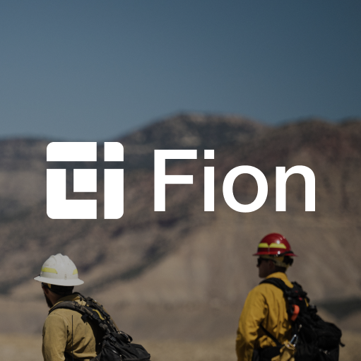
Introducing Fion, a powerful custom-built mobile app designed to equip firefighters with the operational efficacy and situational awareness to make educated, data-driven decisions, even offline. After weeks of intensive user research and market exploration, we worked hand in hand with Fion to design a strategy and implementation plan to build out their application, value proposition, and brand identity from the ground up. To break down the complexities and abstractions of Fion’s interface, we honed in on sharpening the distinct iconography, typography, and design elements of their visualizations to deliver a seamless, interactive experience that firefighters can navigate with ease.
Introducing Fion, a powerful custom-built mobile app designed to equip firefighters with the operational efficacy and situational awareness to make educated, data-driven decisions, even offline. After weeks of intensive user research and market exploration, we worked hand in hand with Fion to design a strategy and implementation plan to build out their application, value proposition, and brand identity from the ground up. To break down the complexities and abstractions of Fion’s interface, we honed in on sharpening the distinct iconography, typography, and design elements of their visualizations to deliver a seamless, interactive experience that firefighters can navigate with ease.
Other Insights

We recently had the pleasure of partnering with Paladin Drones to bring their vision to life online. Our team designed five engaging pages that capture the essence of their brand, infusing personality and clarity into every aspect of the site. From initial concept to final execution, we focused on crafting a digital experience that not only looks great but communicates the innovation and ambition behind their work. We’re excited to see how Paladin Drones continues to make an impact, and we're grateful to have played a part in their journey.
Read More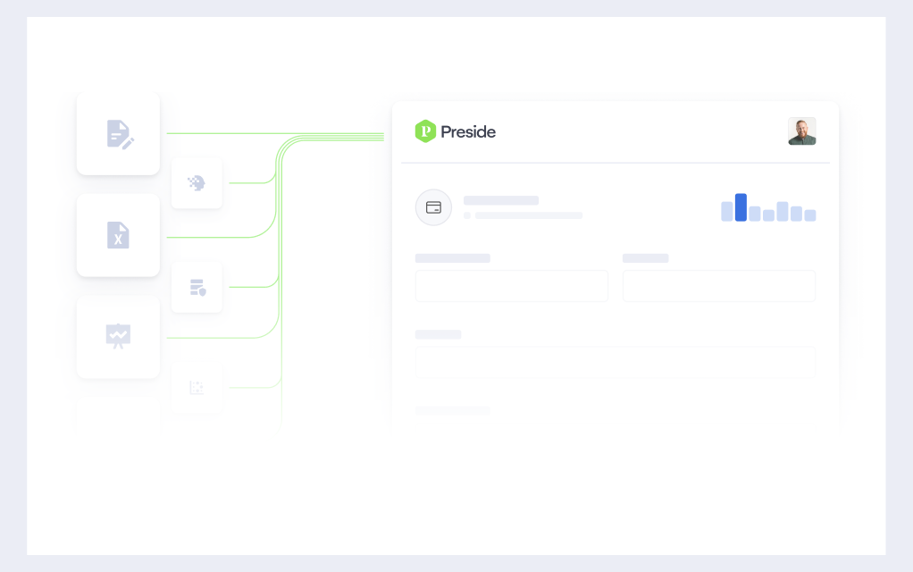
At Caviar, we’re proud to have designed Preside’s new website, a modular, intuitive, and affordable operations management system for Public Safety. The site features a dynamic homepage, comprehensive overview page, support section, and three engaging product pages. To enhance user experience, we also created a series of captivating hero animations that bring the platform to life. Discover how our innovative design elevates Preside's digital presence at usepreside.com.
Read More
The newly rebranded and redesigned Macabacus website is live. It was a pleasure to embark on this transformative journey, collaborating closely with the Macabacus team to redefine their brand identity and rebuild their digital presence. From crafting a modern visual language to developing engaging animations, icons and intuitive layouts, every aspect of the redesign reflects our shared vision of enhancing user experience. We’re excited for users to explore the fresh look and feel of Macabacus, which now beautifully embodies its commitment to excellence in finance and productivity tools.
Read More