Client
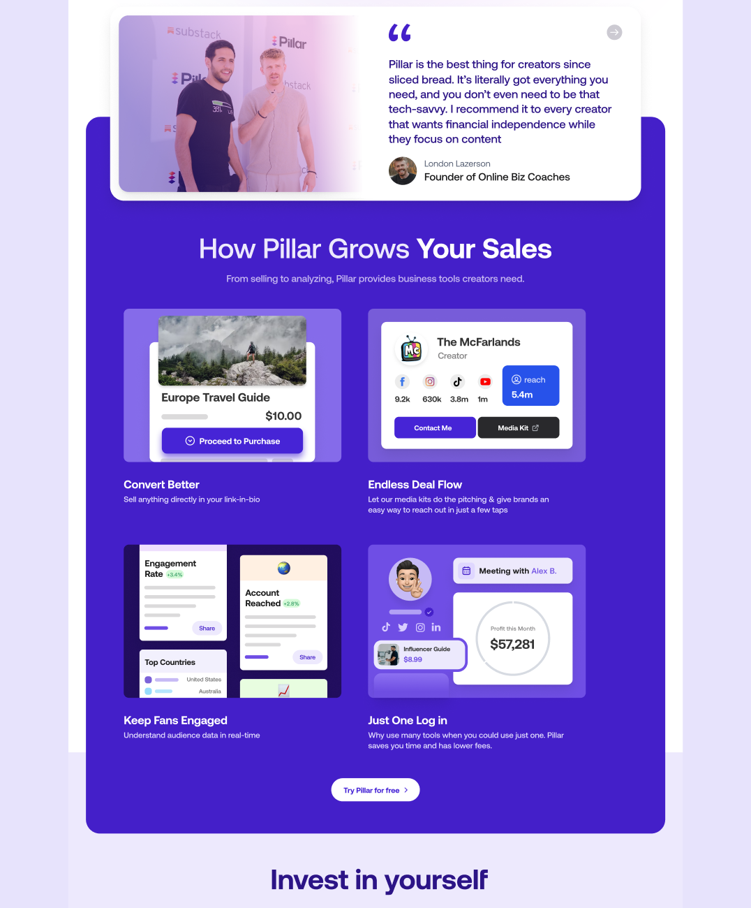
Pillar is a platform at the heart of the growing creator economy, helping creators turn their passions into lasting businesses. With tools like a creator store and media kit, Pillar provides a space for solo entrepreneurs, artists, and influencers to make money from what they do best. It’s the perfect place for creating and selling digital products, coaching sessions, courses, or for getting the most out of partnerships and sponsorships using smart tech. Our task was to enhance Pillar’s landing page to improve visitor engagement, a common challenge for many online businesses.
Problem
Pillar wanted to attract more users and expand its reach to new and more target markets. The platform struggled to clearly explain what it offers on its website and needed a landing page redesign. The main focus was to attract potential users, encourage sign-ups, and enhance the experience for mobile users, all of which are key to success.
Solution
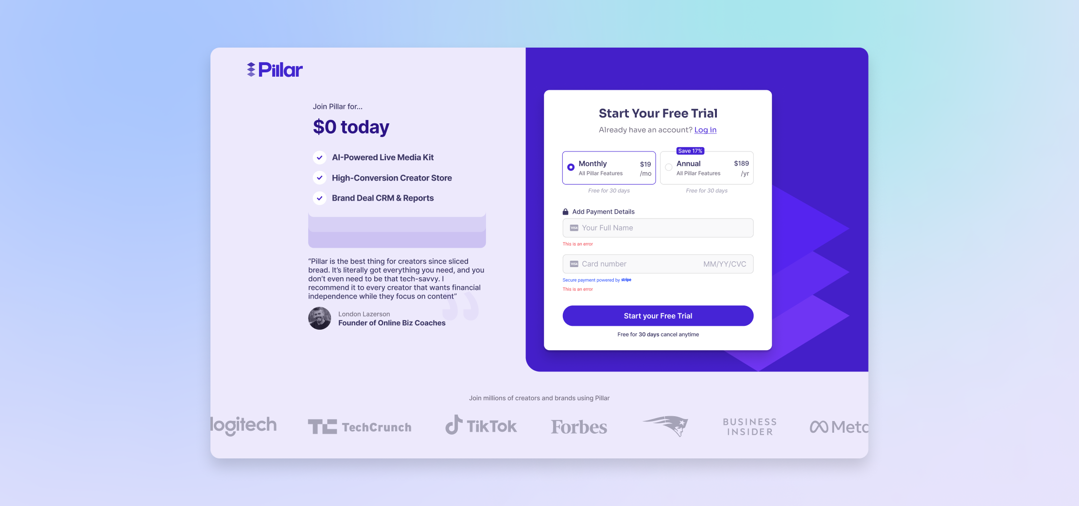
Working together with Pillar’s innovative leaders, we crafted a story for the landing page that people could connect with, keeping in mind the best ways to make a landing page work well. We completely redesigned the page, adding eye-catching illustrations and patterns, including custom drawings and moving pictures, which are critical for a landing page that converts and increases traffic.
Showcasing Pillar's Best Features
We made slight changes to Pillar’s logo to make the brand look better, making sure it fit the innovative and modern style of the new landing page. This step kept the brand’s identity while also updating the website’s look to help with getting more conversions.
Building a Strong Base
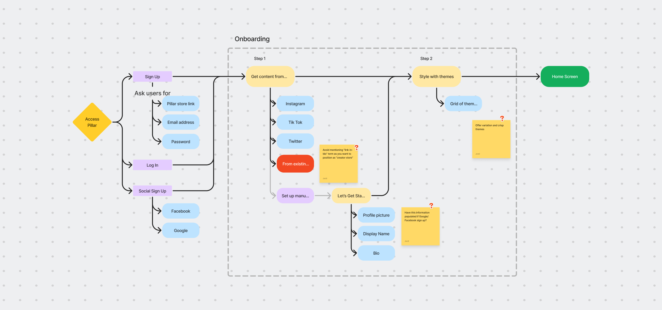
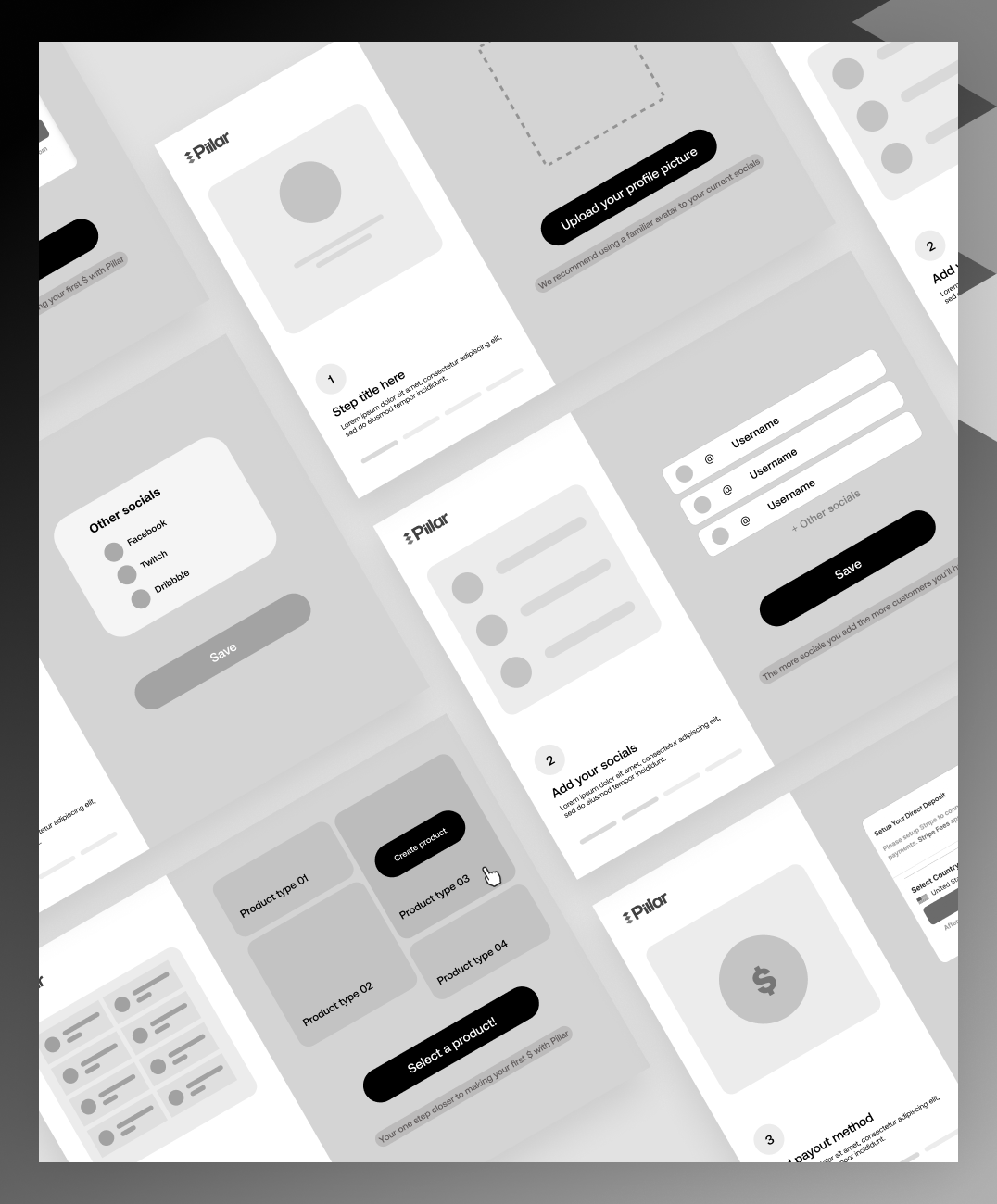
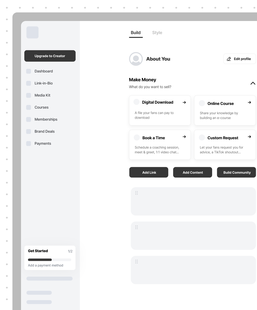
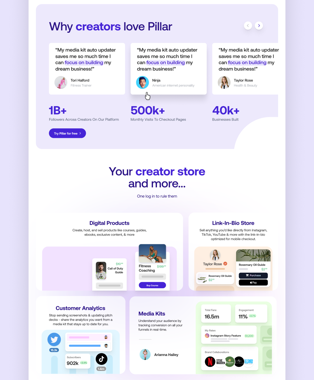
We used a step-by-step method to create a strong basic design for the landing page, making sure it clearly showed Pillar’s message. We carefully planned the layout, and created wireframes showing off the features, advantages, and pricing to help improve conversion rates.
Illustrations that Innovate
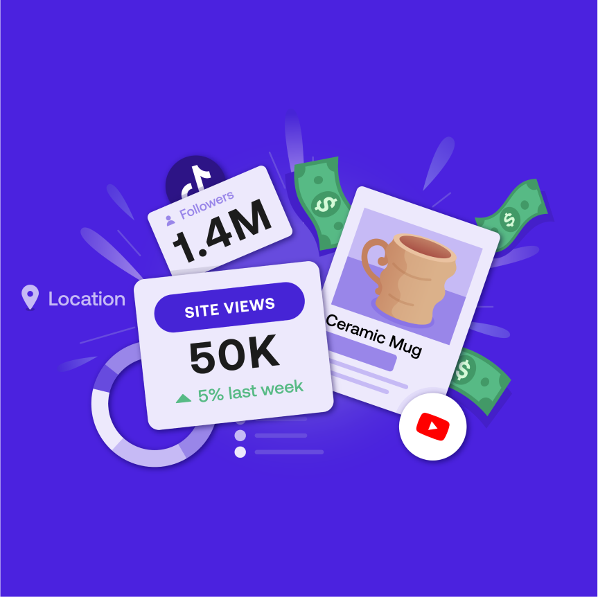
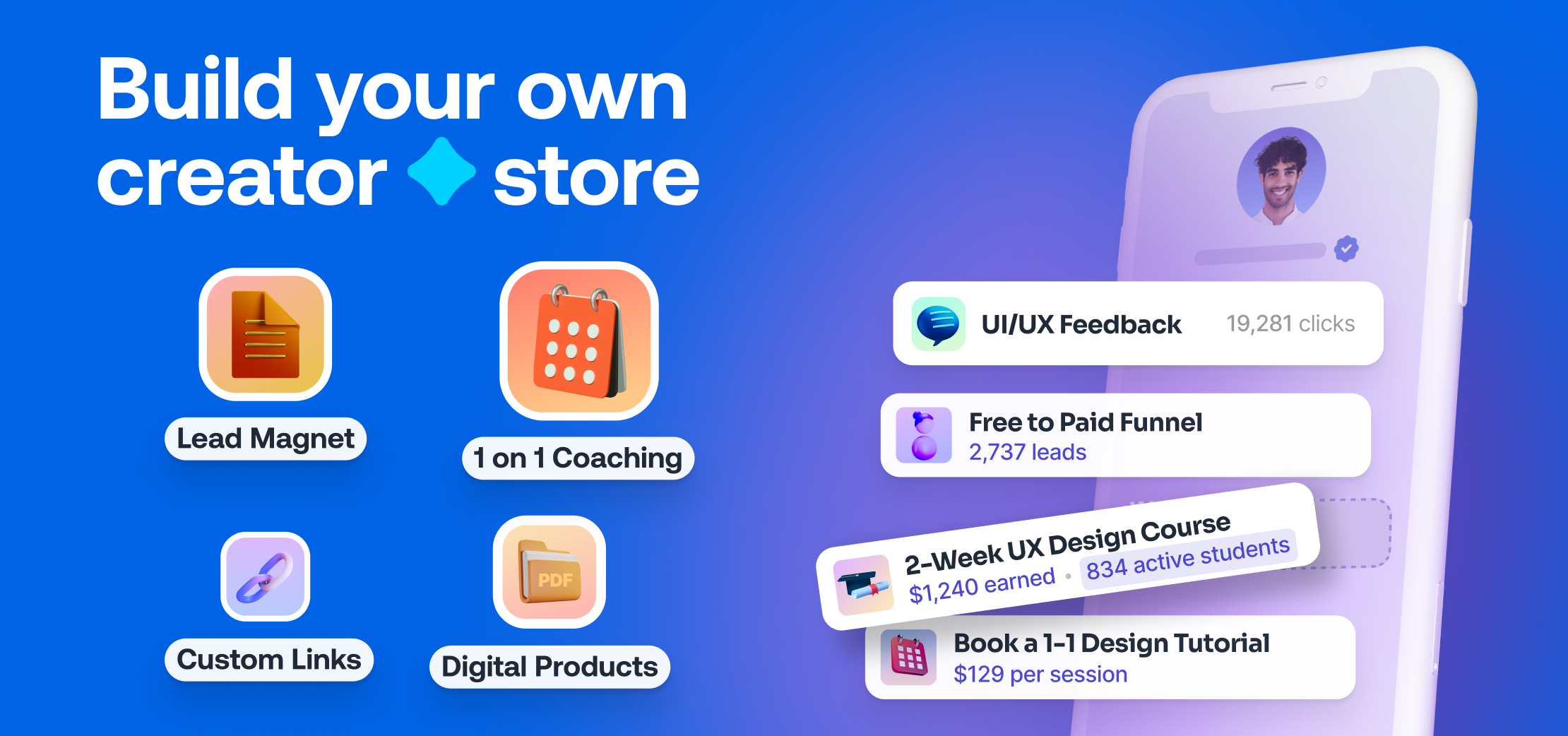
We designed innovative and fun illustrations to explain Pillar’s complex ideas in a simple way. This fits with how to make a landing page that draws people in with visuals that are easy to understand and appealing.
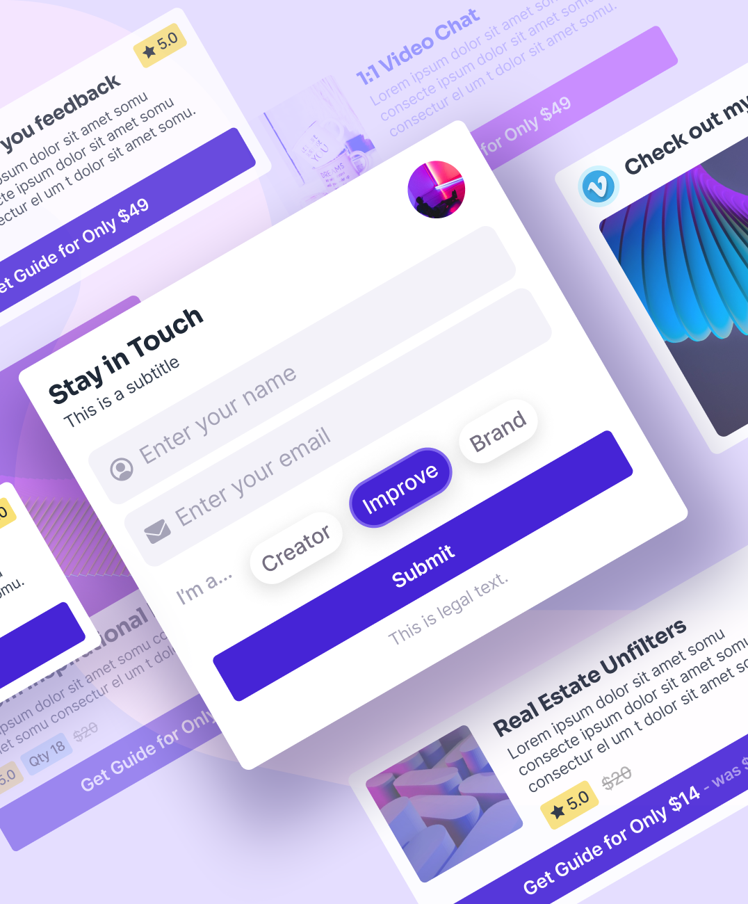
Entertaining Animations
Adding fun moving icons, patterns, and graphics made the page more interactive and enjoyable. This approach, which is a key part of a successful landing page, didn’t just explain the product’s benefits but also got people excited about it.
Brand new Identity
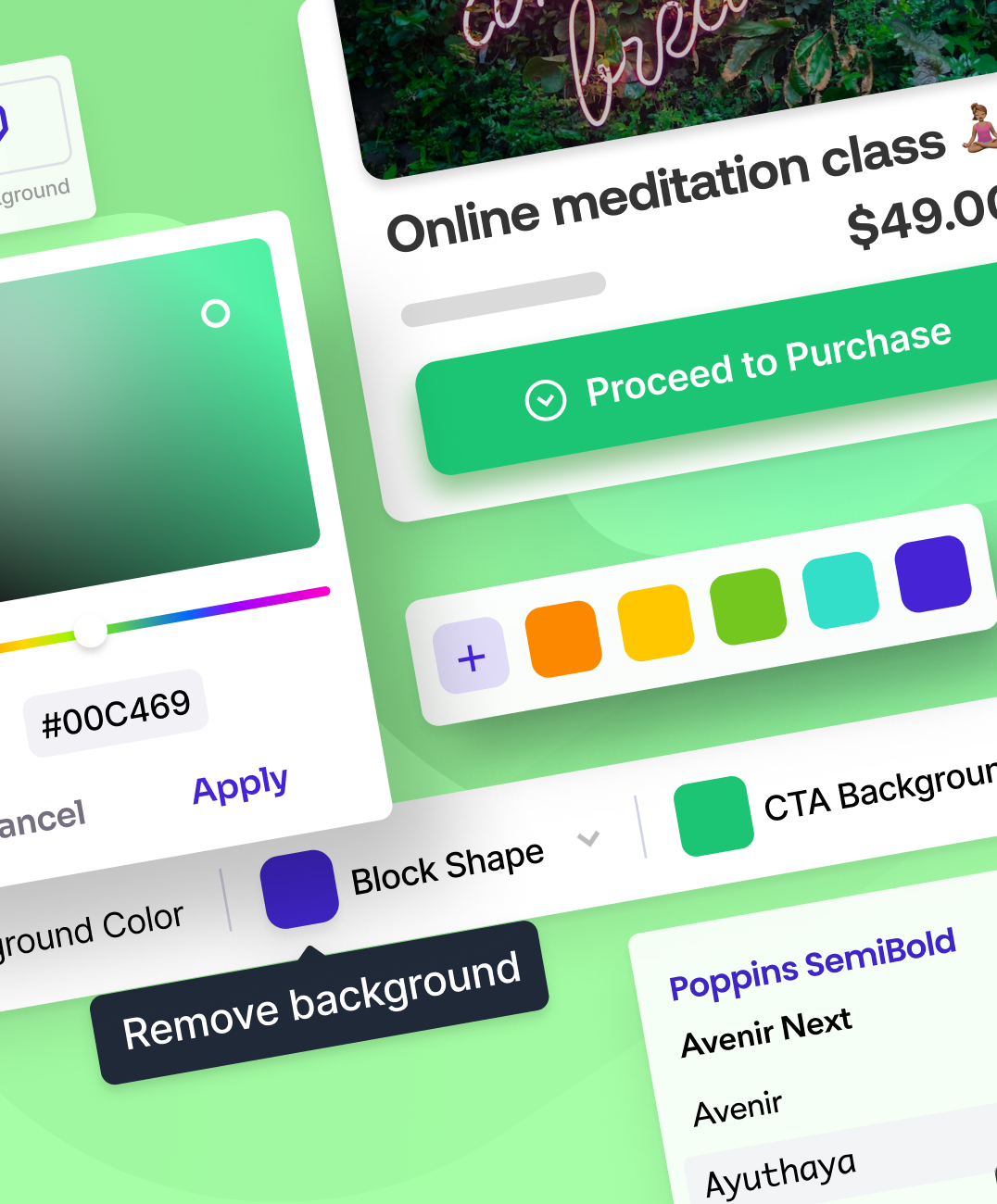
We introduced a new set of bright colors and a stylish, contemporary font to make the brand’s image stronger, which is important for a successful landing page redesign.
Making a Good First Impression
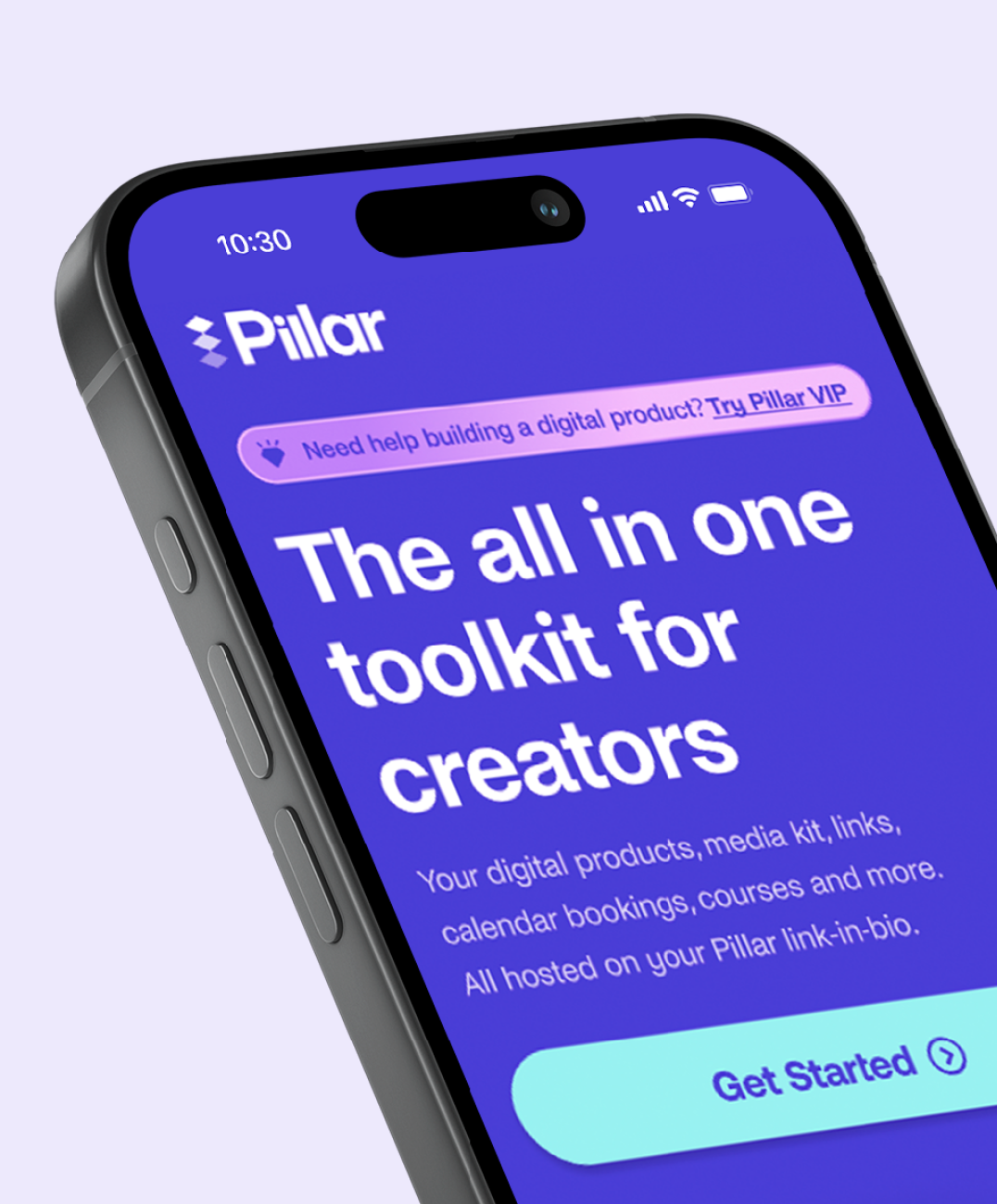
The hero section is all about making that strong first impression. We designed it with graphics showing how the product is useful for different groups, which is recommended for better conversions.
Flexible Designs for Every Platform
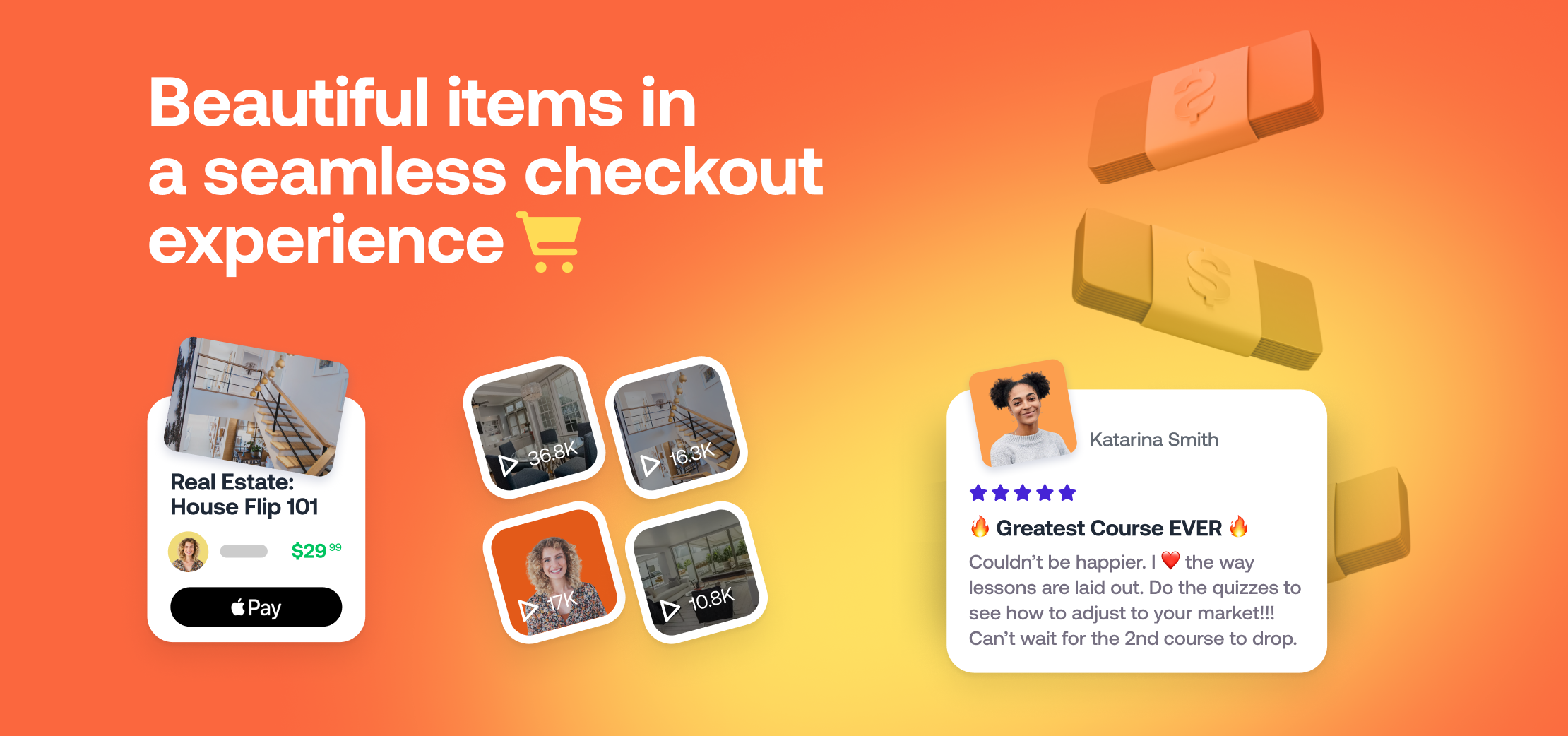
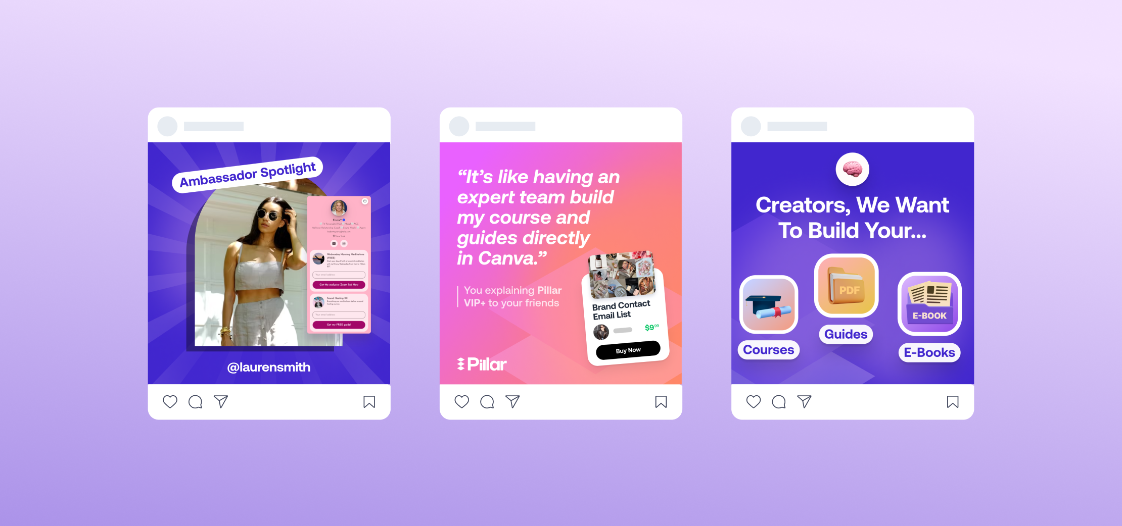
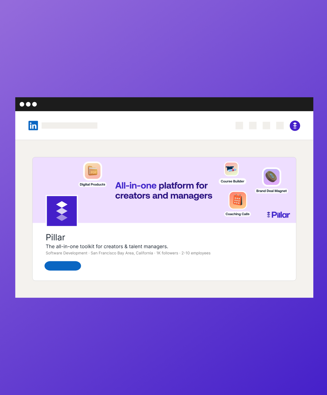
We ventured far off the confines of designing just Pillar’s website. We created multiple social media assets for them so use on their LinkedIn, Instagram, and other platforms. Due to Pillar’s product being highly reliant on creators, social media is not only a familiar, but an important area for them to grow their business. We needed to hit these out of the park in order to wow potential clients.
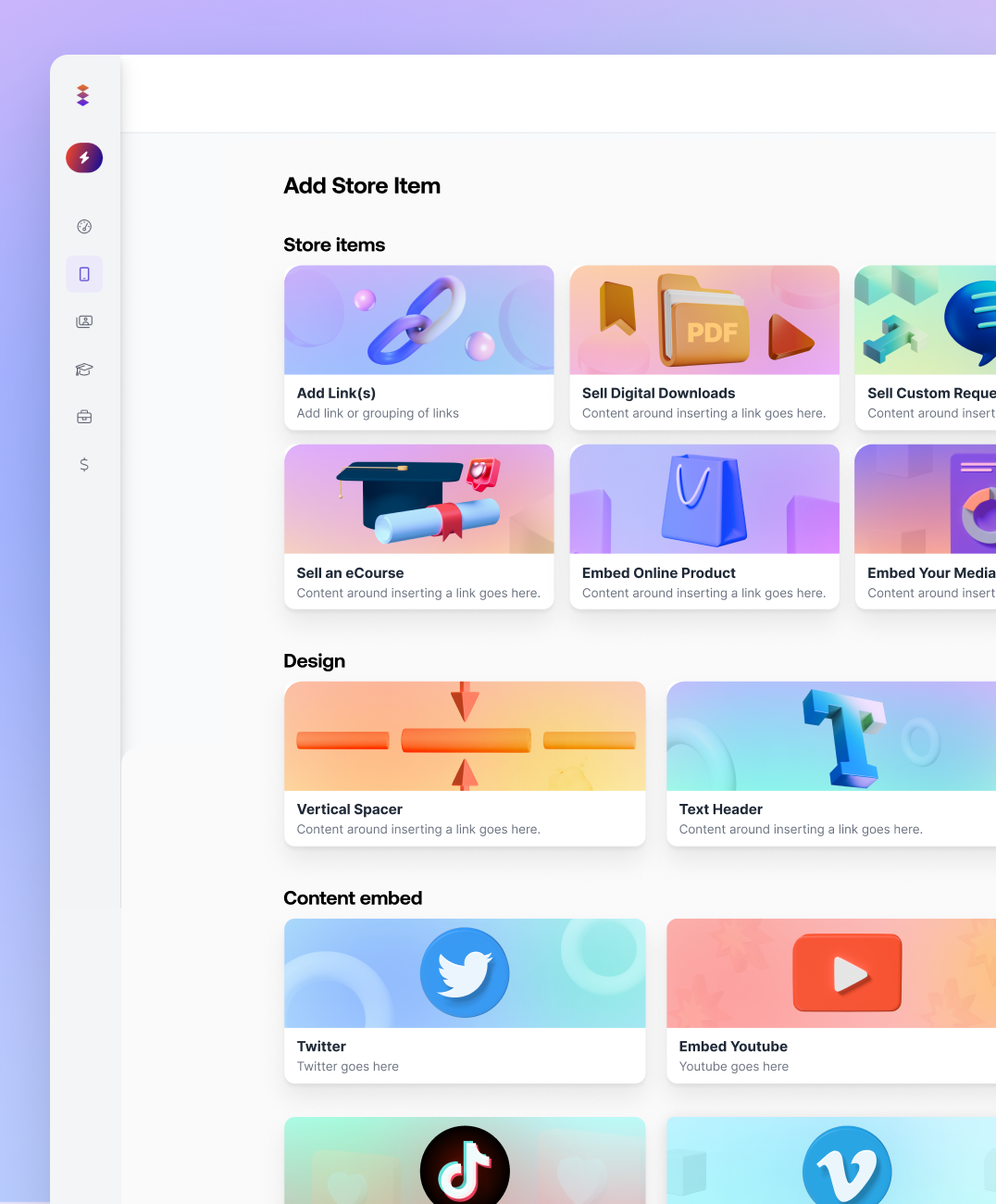
Stylish UI for the Pillar Store
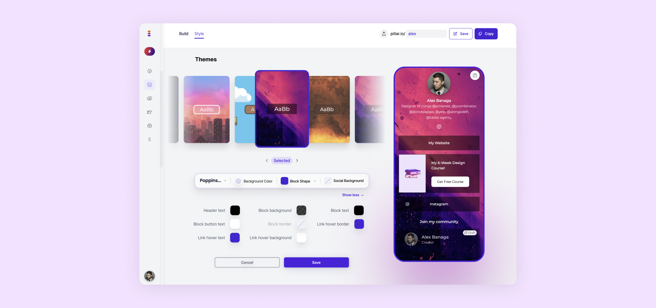
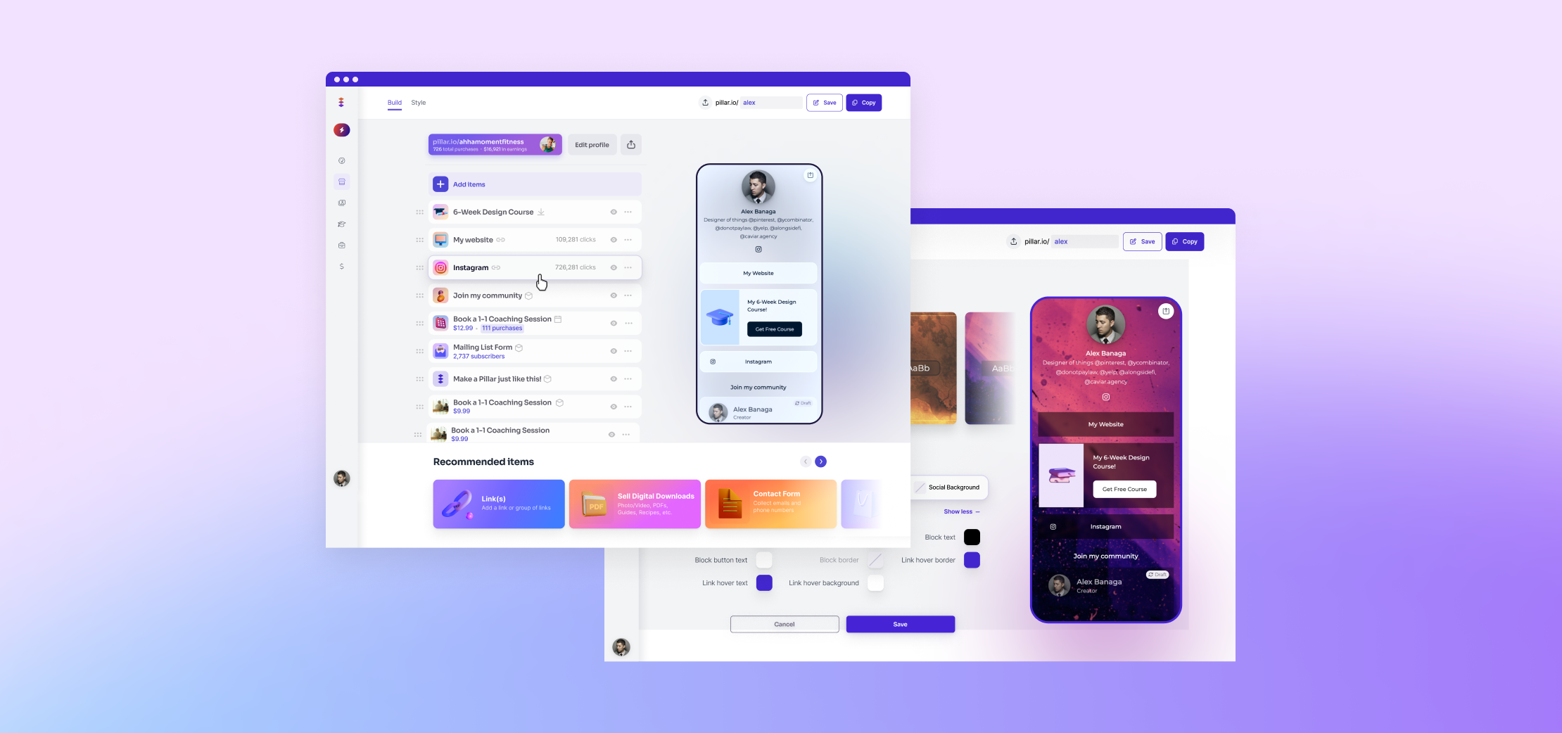
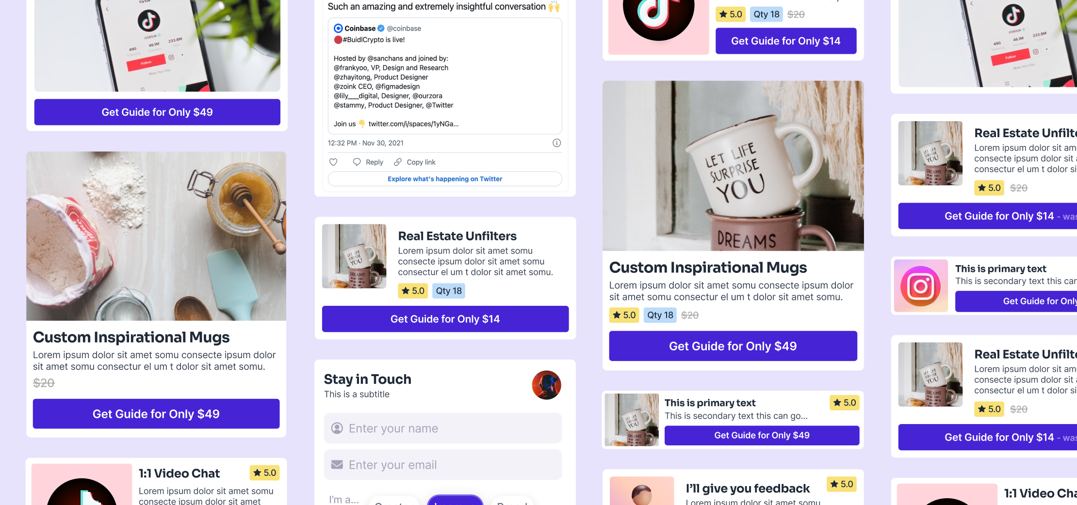
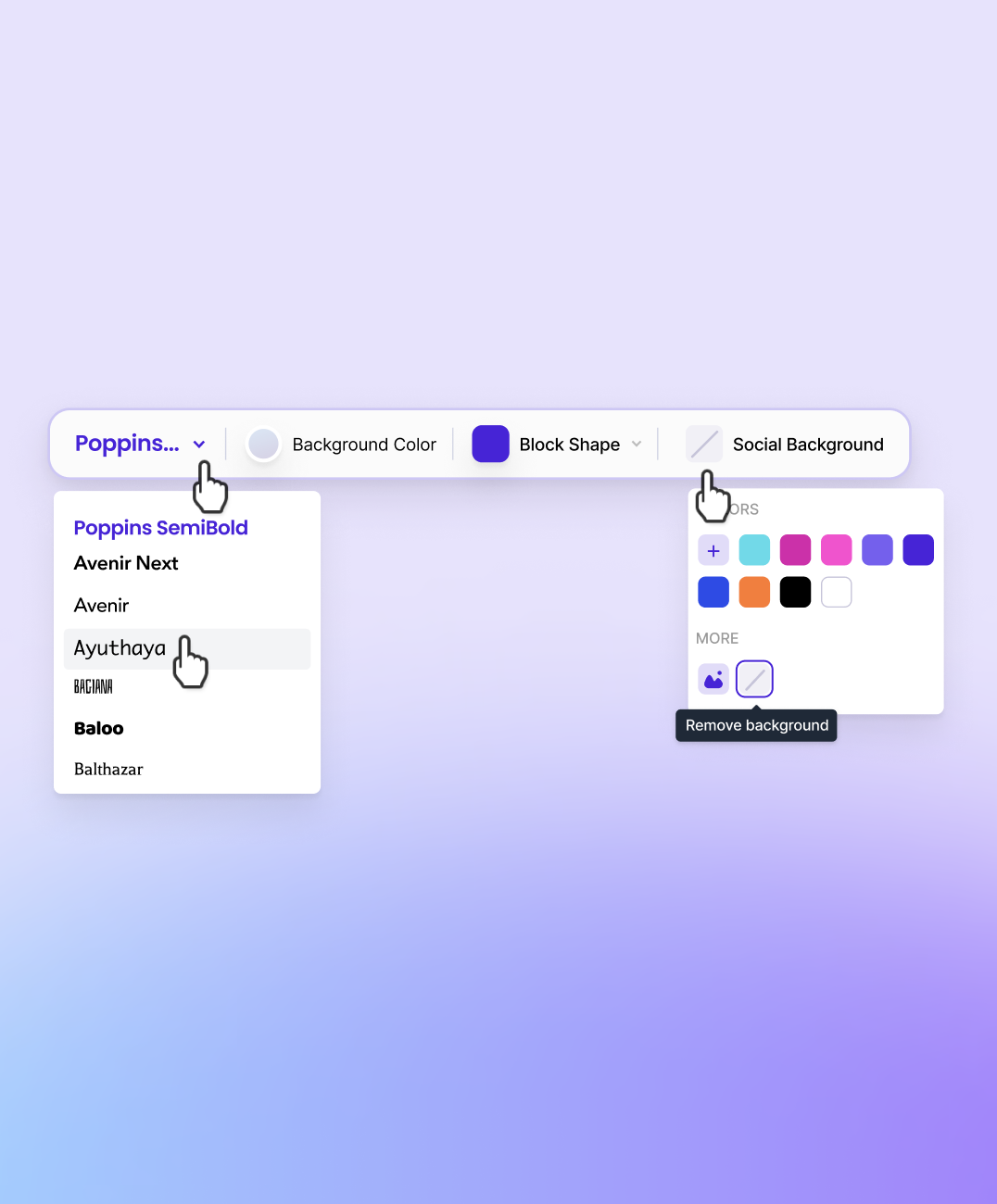
Pillar’s creator store is made up of two important parts. The first part is the builder menu. Here, creators will build out their pillar store using pre-made and easy to use building blocks to streamline their revenue generation. The second part is the theme menu. Here, creators will customize their store from a wide variety of options. Every aspect of their store is customizable, down to the font!
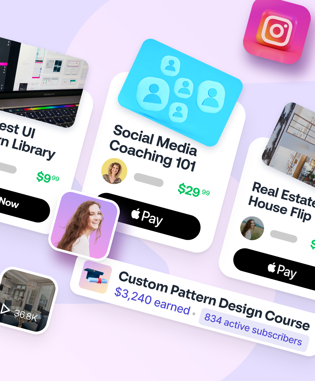
Unlocking Revenue Streams
On the viewer side of the pillar store, we have monetization blocks and custom 3D icons for each store item. The monetization blocks are what is built up from the builder menu creators use, and will display in a clean and descriptive way for all viewers to see. This is where Pillar hosts its main source of revenue generation for creators.
Creating Conversions Through Investigation
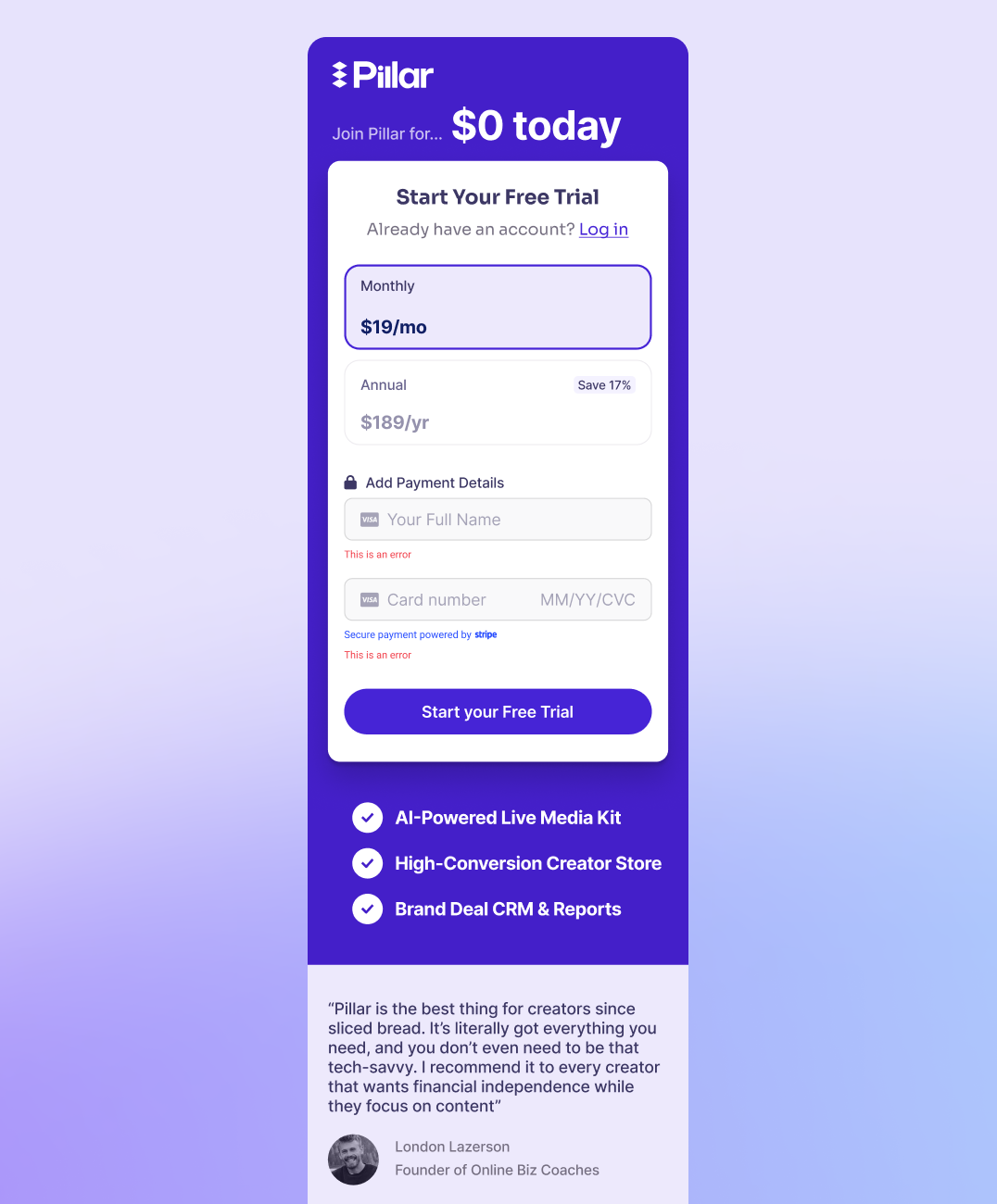
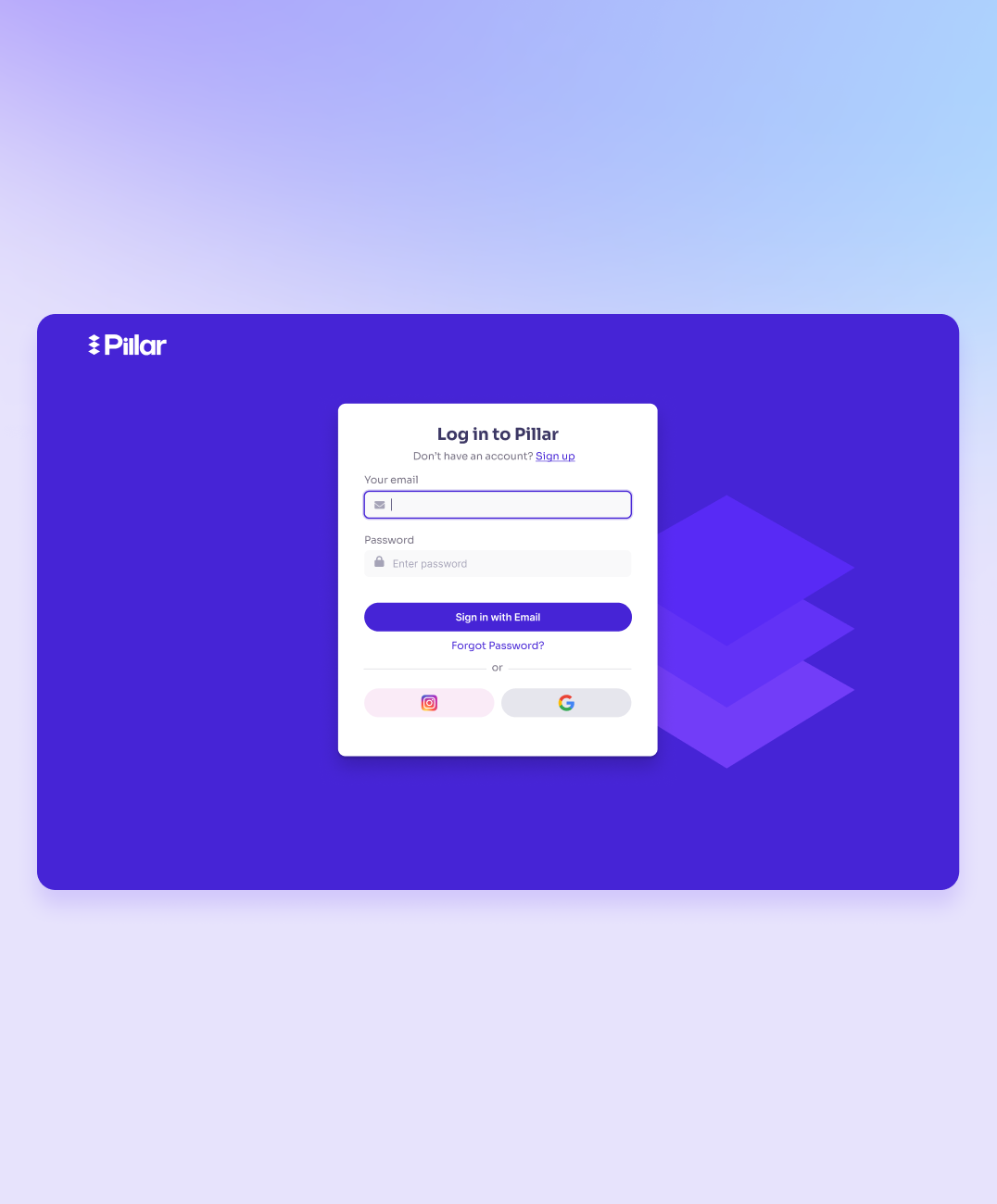
We added a Google sign-in button as a new way to increase conversions and A/B tested the theory against other options. This change was a big success in getting more conversions.
Universal Functionality
All these efforts led to a well-made, flexible website that not only made it nicer for users but also helped turn more visitors into paying customers.
"Caviar had an exceptional design team and super-talented product understanding in general. We loved working with them."

Press

"Through Pillar, creators can easily find brand deals and organize inbound interest from potential sponsors with the Brand Deals search engine and Partnership Portal features, respectively."

"With Pillar.io, you can effortlessly create compelling media kits that showcase your brand, products, or services in an unforgettable light."
Product Services

The Results
45%
Increase in Landing Page CVR on Desktop
2x
Increase in Users Since Caviar Engagement
27%
Growth in Clickthrough on Pillar Pages
