Client
Patlytics — An AI-powered patent platform. They provide a suite of “customer-obsessed” technology to aid in discovering, analyzing, and reporting on intellectual property data.
Challenge
Patlytics reached out to us at Caviar with the intent to completely rebrand their company and re-imagine their website. With a logo that did not adequately represent the brand, and a website that did not harbor the functionality and visual appeal that the brand needed, we set out to create a logo, brand identity, and website that incorporated everything the Patlytics team believed the brand needed and more. Patlytics gave us the beginning foundation of wanting to utilize green and black in their logo and website, and we worked from there.
We needed to create a professional, more serious logo that portrays trust, intelligence, luxury, and gold standard. Aside from branding, we needed to create a very pro-user interface — because that’s what Patlytics is all about. With several layers to their brand and what they provide, we wanted to be sure it was known from the start that Patlytics provides everything a future client will need and then some.
Solution
We designed a brand book that both Caviar and the Patlytics team were ecstatic about. The brand book carried the project through to the end. From it came a custom logo, hero animation, and website with the new Patlytics branding. These updates include the custom graphics and animations used to emphasize features that users will receive when using Patlytics.
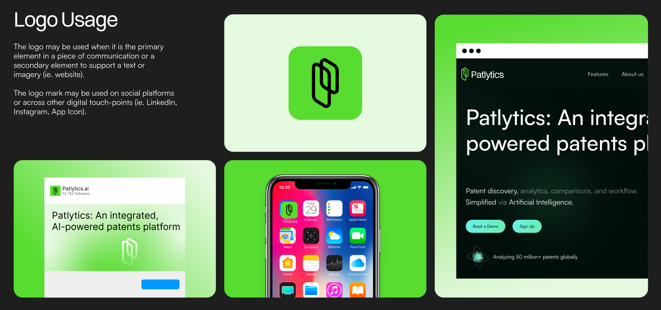
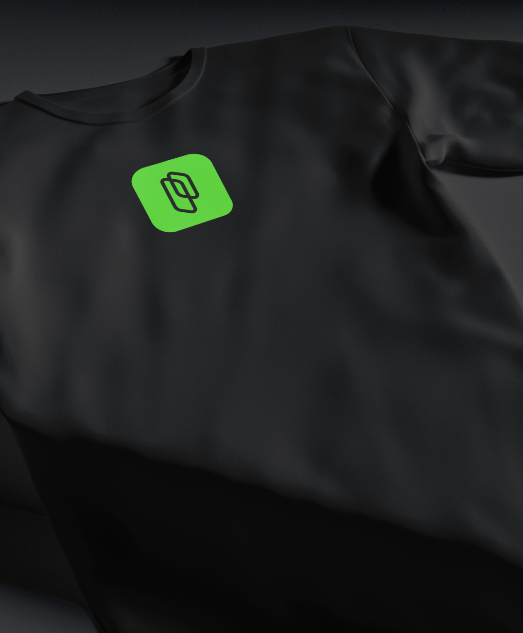
The logo creatively portrays a “P” for Patlytics, and demonstrates the serious, analytical visual representation that the company was looking for. The hero animation adequately represents the powerful intelligence is the backbone of the company. As you move through the new website you’ll continue to see animations that portray simple resolutions to formerly-known complex problems. This was an important aspect of the design. Caviar wanted to make it a no-brainer for Patlytics’ current and future clients that they can trust Patlytics with their patent creation, protection, enforcement, and defense endeavors.
The landing page flows in sections of intentional chronological order for users to build an understanding of what Patlytics exists for and how it can be of benefit. To us, that is what makes a perfect landing page.
Inventing An Identity
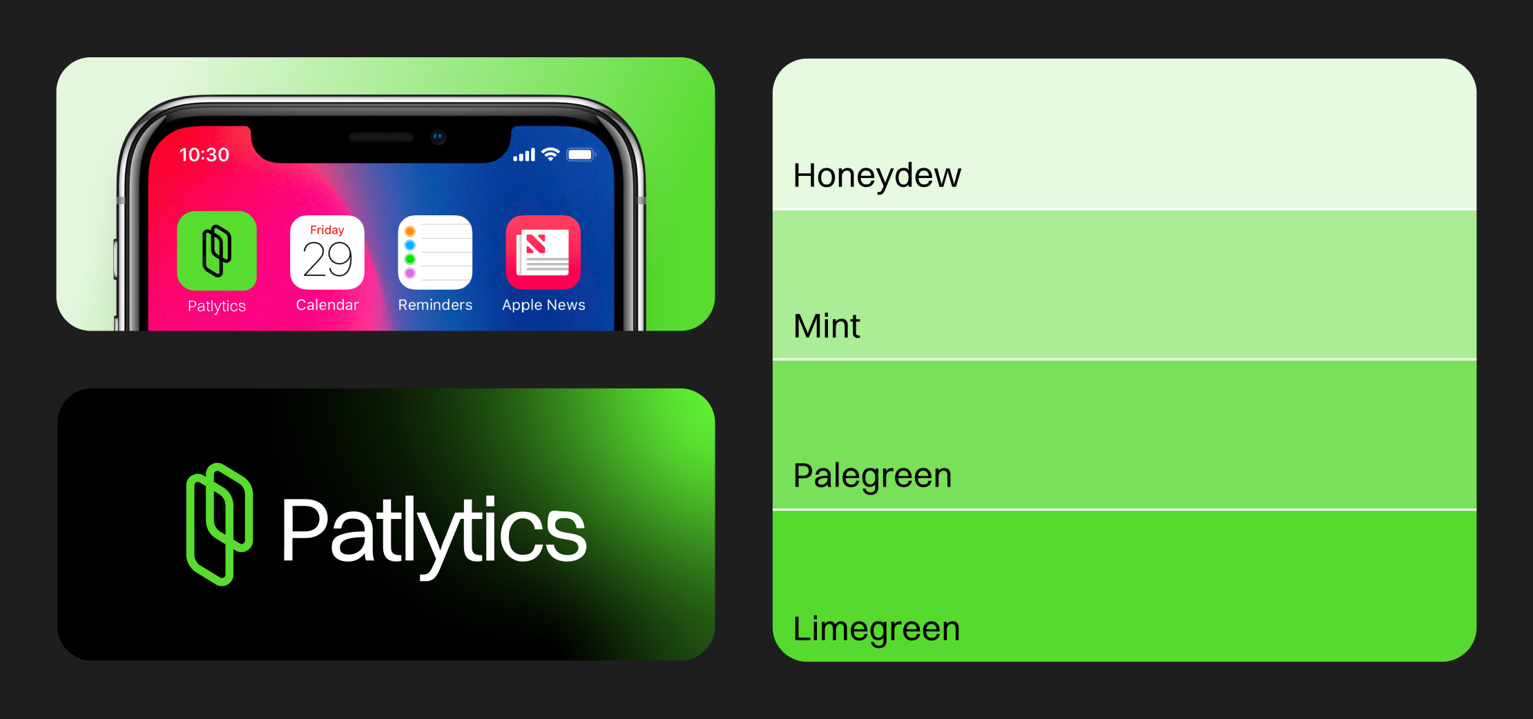
Caviar and the Patlytics team embarked on a collaborative journey to craft the visual identity of Patlytics.ai, a forward-thinking brand. To capture their essence, we first and foremost dove head-first into the creation of their new logo which emerged as the cornerstone of Patlytics visual identity, symbolizing their commitment to innovation and excellence. The team at Patlytics wanted a logo that felt like the matrix and we believe we hit bulls-eye with their final logo that also portrays a “P” for Patlytics in a unique and creative way.
We then meticulously curated a typography that reflected modernity and professionalism, aligning perfectly with their innovative image. Delving into the intricacies of color theory, we selected a palette that evoked trust, intelligence, and a sense of alpha as Patlytics seeks to be the leaders and innovators of the IP community. Experimentation with gradients added depth and visual interest to the brand’s digital assets, enhancing the overall user experience.
Our collaborative effort resulted in a cohesive and compelling visual identity that perfectly encapsulated the essence and values of Patlytics brand.
Drawing Out The Details
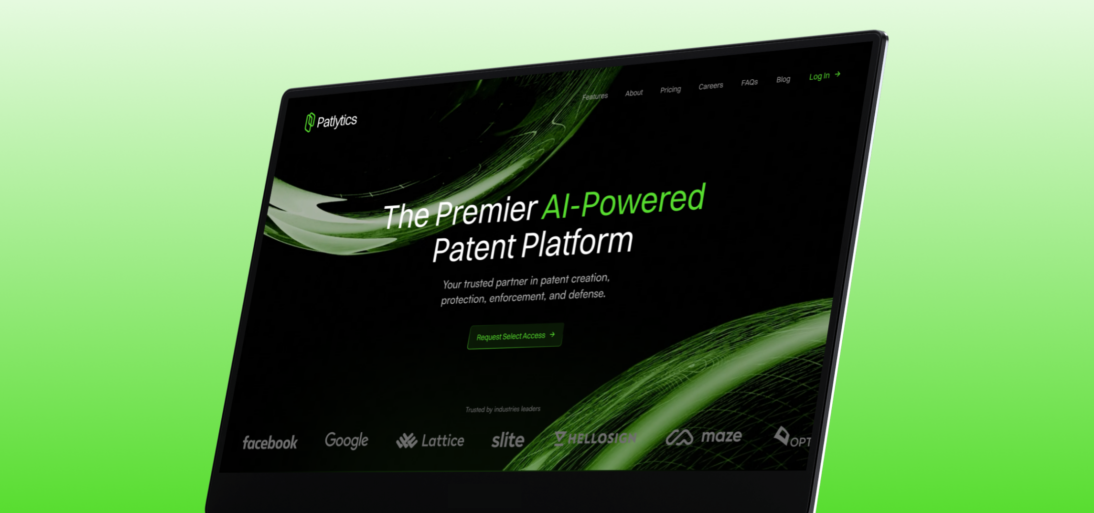
The animations incorporated into the Patlytics website play a crucial role in reinforcing the brand identity and setting it apart in the digital landscape. By strategically integrating animations that are in motion as users navigate the website, emphasis is placed on the innovative “AI” aspect of the platform, capturing attention and engaging visitors. Among these animations, the main animated “globe” emerges as a standout feature, exuding a futuristic aesthetic that powerfully symbolizes the core essence of artificial intelligence which is the foundation of Patlytics.
The consistent use of the main green color from the palette throughout these animations further reinforces brand recognition and cohesion. By infusing dynamic visual elements that enhance user interactions and create a memorable digital experience, these animations not only elevate the website’s visual appeal but also play a pivotal role in solidifying Patlytics.ai’s unique brand identity in the competitive digital landscape.
An AI Landing Page That Feels More Organic than Artificial
As a part of our collaborative creative journey, Patlytics and Caviar embarked on the exciting task of designing and developing their Landing Page that truly encapsulates their newly solidified visual identity. Seamlessly infusing elements from the updated brand book into every aspect of the website, we ensured a cohesive and consistent brand presence that resonated with Patlytics’ core values.
The Landing Page serves as a dynamic showcase of the brand’s essence, where visitors can immerse themselves in a seamless digital experience with animations that portray quick solutions, ease, and efficiency. With a focus on intelligence and innovation, the Landing Page stands as a symbol of commitment to translating our client’s vision into a captivating and impactful online platform that leaves a lasting impression on visitors.
Animating The Autonomy of the Product
The “globe” hero animation is the staple of the website. From the moment a user enters the platform they are welcomed by this animated design that immediately communicates futuristic, intelligence, and innovation. When we see this, we see the potential of Patlytics perfectly expressed as an animation.
Breaking Down The Barriers
The landing page for Patlytics was thoughtfully structured with five distinct sections, each serving a specific purpose in guiding users through a coherent and informative journey. This intentional layout was strategically designed to present information in a chronological order that would optimize user understanding and engagement. By dividing the content into these sections, we aimed to provide a seamless user interface that takes users through the key aspects of Patlytics in a logical progression. Utilizing components from Patlytics brand guidlines, the landing page introduces the brand then goes on, highlighting its unique features and benefits. The structured layout ensures that users are presented with relevant information in a systematic and user-friendly manner. This deliberate approach not only enhances user experience but also reinforces the brand messaging and facilitates a more meaningful interaction with Patlytics’ offerings.
Mobilizing The Future of Intellectual Properties
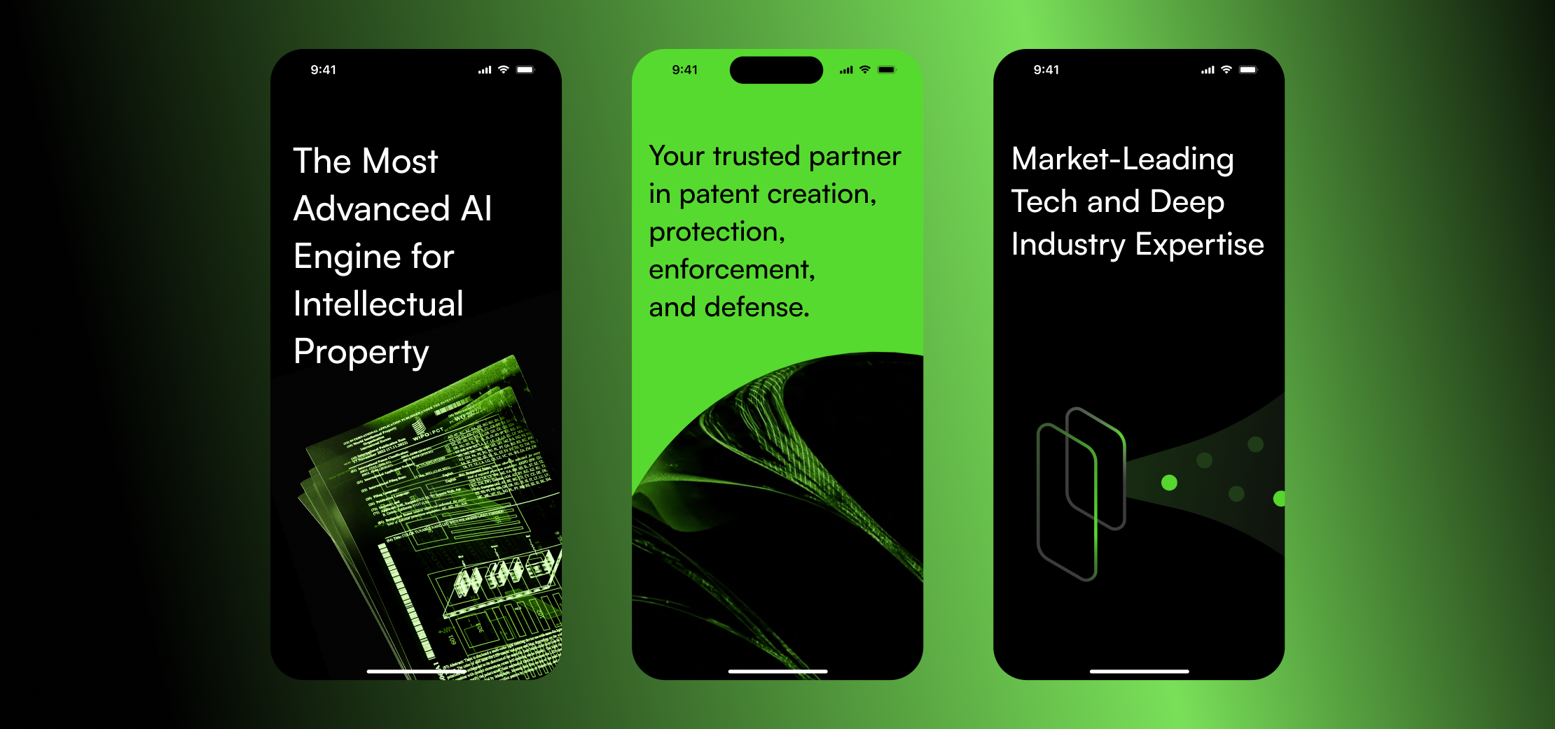
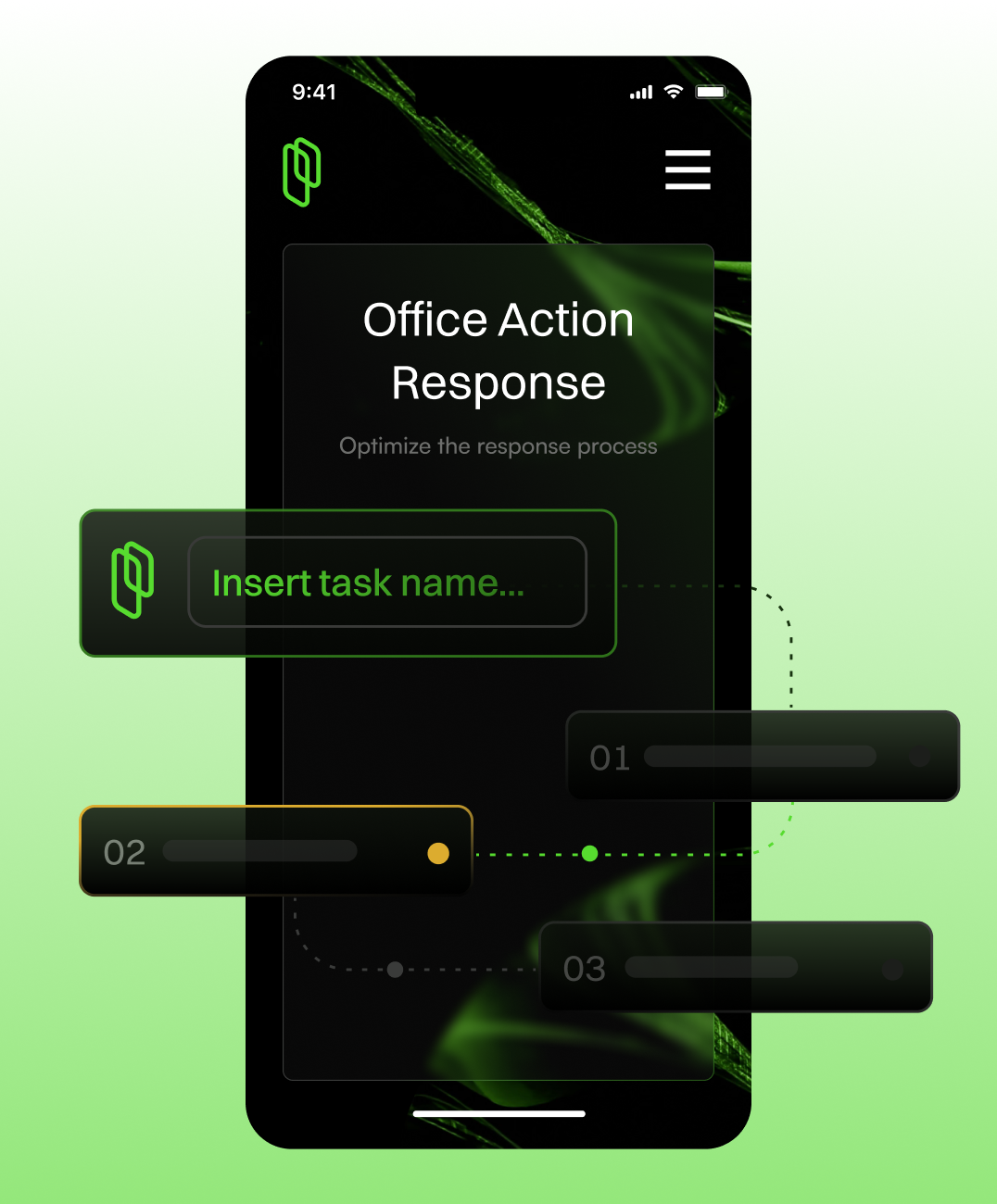
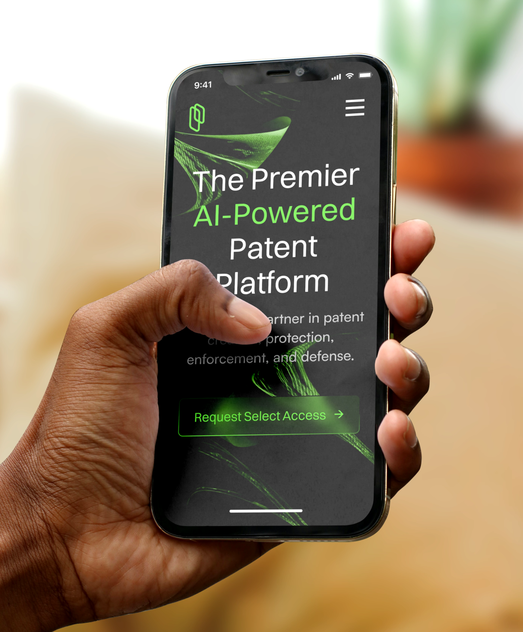
In our design approach for Patlytics, we prioritized seamless integration between the desktop and mobile platforms to ensure a unified user experience. The mobile version mirrors the functionality and aesthetic of the desktop site, maintaining the core features and intuitive navigation while optimizing for smaller screens. Our design process focused on preserving the robust capabilities of Patlytics while adapting the interface for touch interactions and varying screen sizes. This approach guarantees that users can access the full power of the Patlytics platform on the go, with no compromises in functionality or user experience. By maintaining consistency across both desktop and mobile, we enabled Patlytics users to leverage the platform’s insights and tools effortlessly, whether at their desks or on their mobile devices.
"They are experts in setting expectations and delivering projects with precision and speed."

Press

"Google’s Gradient backs Patlytics to help companies protect their intellectual property"

"Patlytics addresses the inefficiencies in the current patent lifecycle, from discovery through to litigation."
Product Services





The Results
$4.5M
Seed Round
50M+
Global Public Patents
10+
Years Experience in Founders

