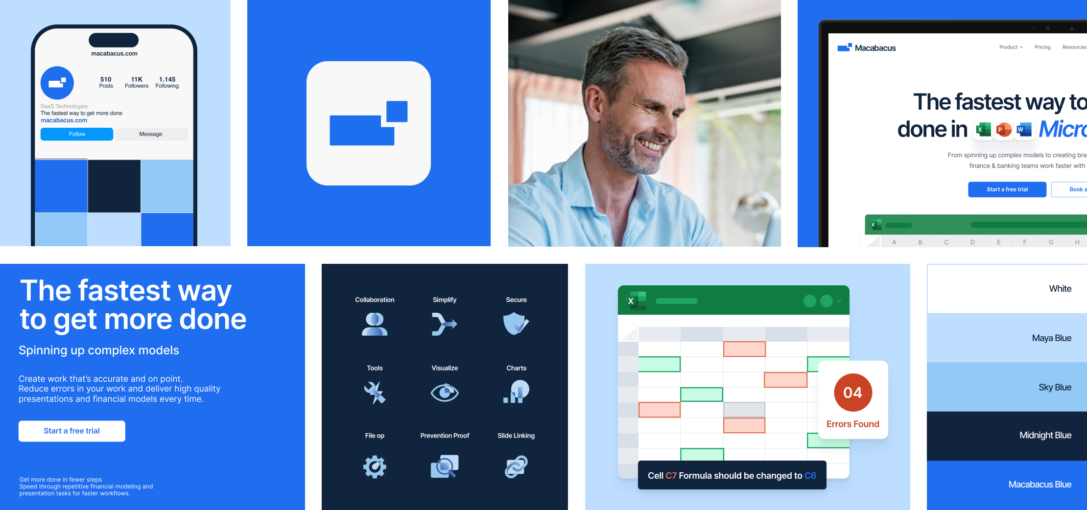
Client
Macabacus enables enterprises to streamline the preparation of financial models and presentations like pitch books with leading Microsoft Office productivity and brand compliance tools used by tens of thousands of finance and other professionals around the world.
Challenge
The Macabacus team approached Caviar with the intentions of a total rebrand. With an outdated platform, and a large clientele, Macabacus felt that it was time to update their visual aesthetic with both their current and future users in mind.
Solution
Together, Caviar and Macabacus started at ground zero and developed visual elements, both static and animated, that make for a memorable and lovable user interface. We explored and re-imagined every aspect of their visual identity — a key factor of which is their brand new logo symbol, color palette, typography, and the guidance to apply all of them to their platform in a unique and intentional way. Two significant details that we worked on for Macabacus are their new set of icons, and their new stand-out hero animations. Both aspects, icons and animations, create light-hearted eye candy that is purposefully placed all over the various sections of their platform. We believe the enjoyable visual elements are a perfect counter-balance for a data and information packed platform. The result is a product that we couldn’t be more proud of and excited to share.
Rebranding Macabacus: A Fresh Vision for Enterprise Excellence
Exploring New Aesthetics
Our rebranding initiative began with a thorough exploration of new fonts, colors, and, most crucially, a redesigned logo symbol. We selected a modern, minimalist font that aligns with the high standards and contemporary nature of Macabacus’s market. This choice not only ensures readability but also echoes the sleek and efficient design ethos of the platform.
In terms of color, we transitioned from Macabacus’s previous dark turquoise to a distinctive “Macabacus Blue.” This new primary color exudes professionalism and trust, resonating with the brand’s commitment to excellence and consistency in data presentation.
The New Logo: A Symbol of Core Values
The centerpiece of our redesign is the new logo. We crafted a symbol that embodies warmth, organization, and collaboration—core values central to Macabacus’s mission. The logo’s design conveys a sense of reliability and efficiency, crucial for a tool used by finance and banking professionals who depend on precision and consistency.
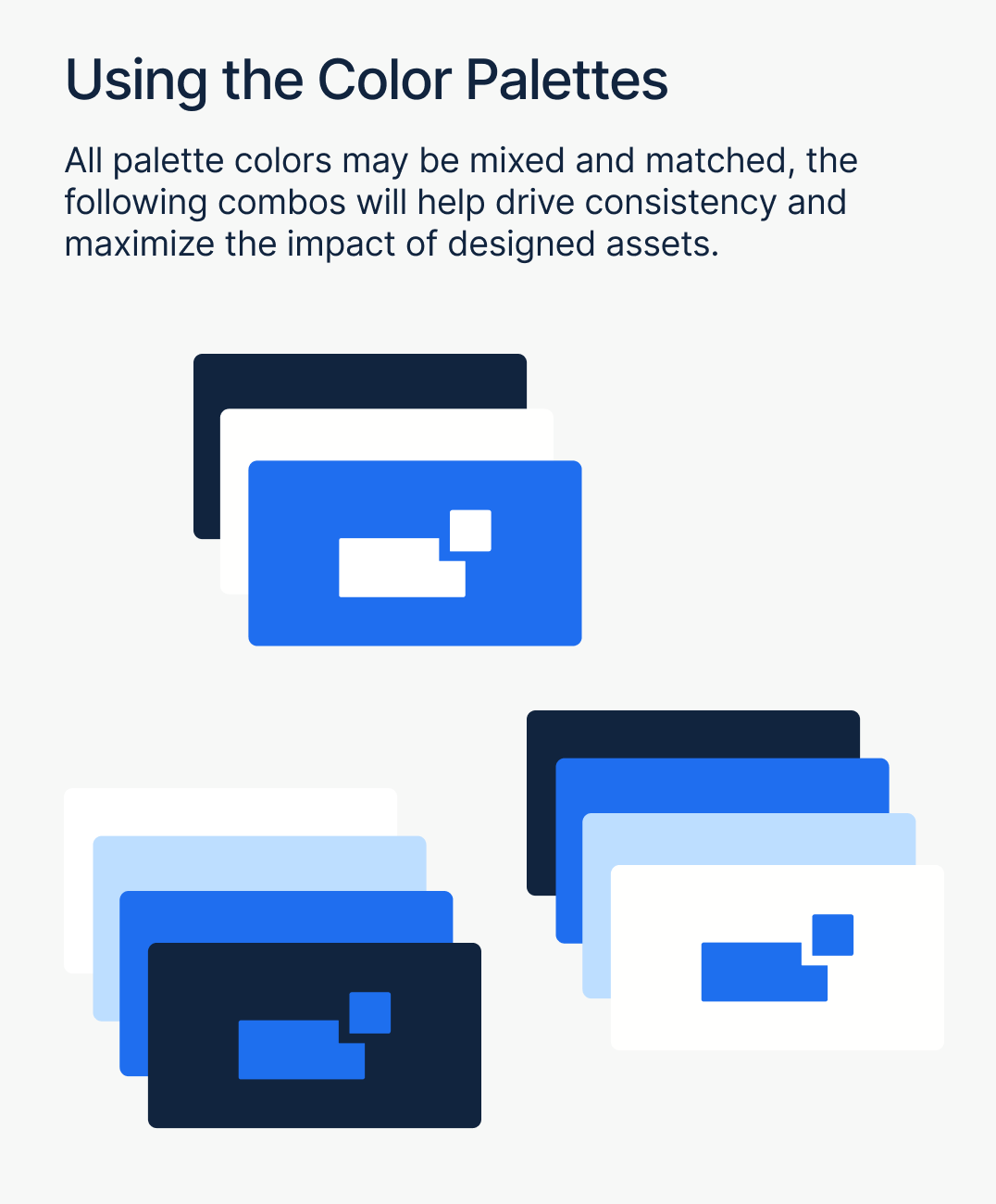
Defining Visual Consistency
To ensure a cohesive and creative brand presence, we meticulously established parameters for color palette, typography, and logo usage. This structured approach enables uniformity across all brand touchpoints while allowing for creative flexibility.
The color palette was employed strategically to create harmonious variations across web pages, text, logos, and icons, ensuring a visually appealing and consistent user experience. Similarly, our approach to type hierarchy—differentiating between headings, subheadings, and body text—enhances readability and highlights key information, while maintaining a uniform appearance throughout the website.
By integrating these elements, we provided Macabacus with a refreshed brand identity that not only aligns with its core functions but also stands out in the competitive landscape of productivity tools.
Impact and Results
The rebranding has significantly strengthened Macabacus’s market presence, reinforcing its role as a leading tool for finance and banking professionals. The modernized visual identity reflects the platform’s advanced features and commitment to helping users standardize documents and maintain brand consistency. Feedback from Macabacus has highlighted how the new design enhances their brand’s credibility and appeal, aligning perfectly with their enterprise-grade service offering.
Illustrations and Iconography: Adding Personality to Precision
In reimagining Macabacus’s platform, we knew that incorporating illustrations and icons would be key to balancing professionalism with approachability. Given the nature of Macabacus—a sophisticated, data-driven tool for finance and banking professionals—infusing a touch of light-heartedness through visual elements helps make the platform more engaging and user-friendly.
Illustrations: Bringing Context to Life
On the landing page and throughout the platform, our custom illustrations serve a dual purpose: they visually represent the product’s functionality and enhance user experience. By integrating elements from the brand’s color palette, these illustrations not only align with the new visual identity but also add a modern, professional flair. This approach avoids overwhelming users with text, instead providing clear, visually appealing representations of how Macabacus benefits its users. The result is a landing page that is both informative and visually striking, offering a refreshing, minimalistic experience.
Icons: Blending Functionality with Flair
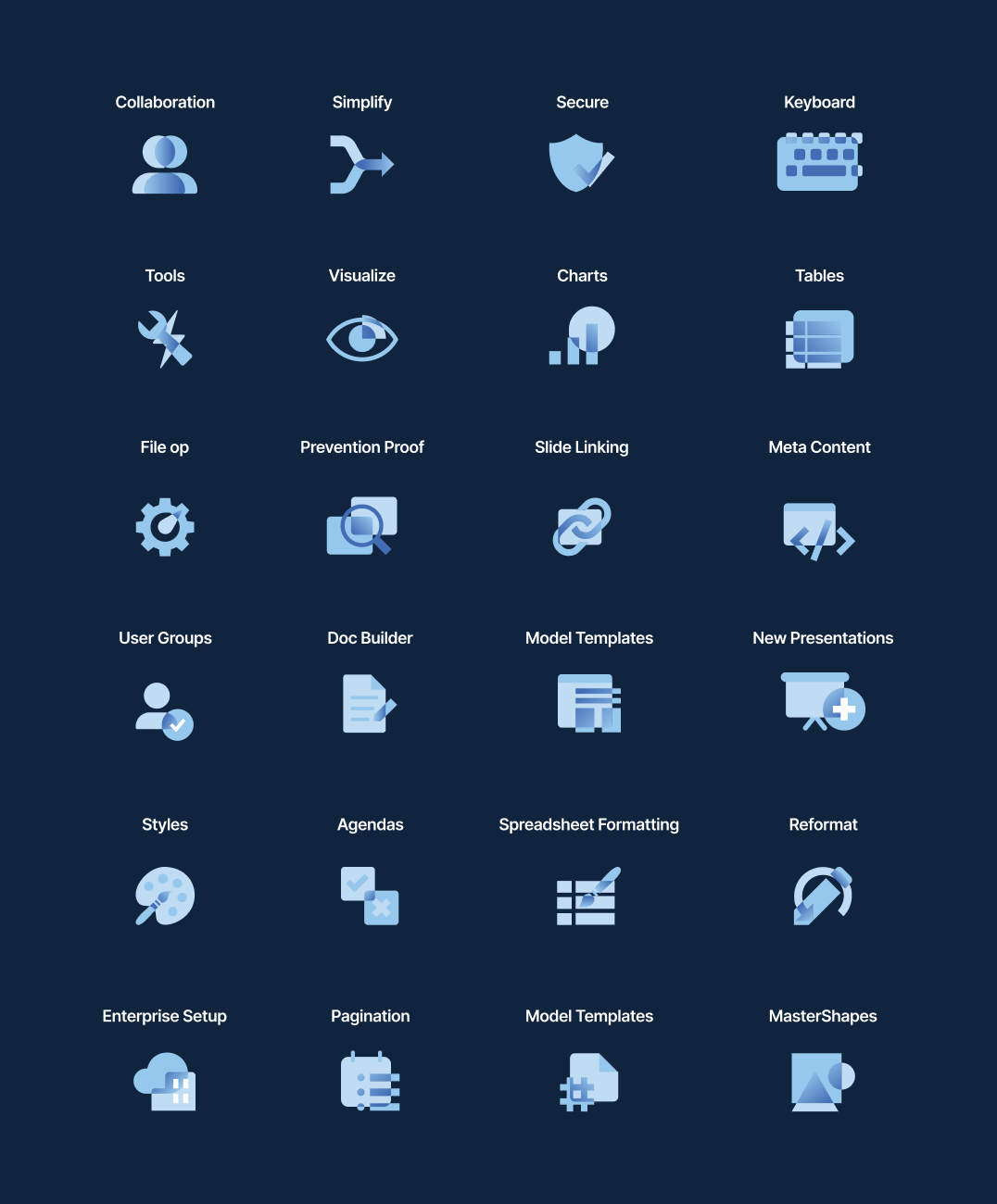
Our bespoke icons are designed to elevate the user experience by blending practicality with visual appeal. Each icon acts as a vibrant, intuitive symbol for different sections of the platform, helping users navigate with ease. Crafted with the same attention to detail as the rest of the design, these icons enhance usability while maintaining a cohesive visual identity. They not only clarify the platform’s functions but also inject personality into the interface, making interactions more engaging and enjoyable.
By thoughtfully integrating these visual elements, we’ve enriched Macabacus’s platform with a modern, professional touch that resonates with its audience while staying true to its core values of precision and efficiency.

Website Pages: Seamless Navigation and Engaging Content
Our redesign of the Macabacus website includes four key pages, each tailored to enhance user experience and drive engagement.
- Home Page: This page offers a comprehensive overview of Macabacus, showcasing its benefits for individuals and organizations alike. It features visually appealing icons and illustrations, clearly communicates what Macabacus can do, and guides users towards an easy sign-up for a free trial.
- Pricing Page: Designed to help users make informed decisions, this page presents pricing plans in a side-by-side comparison, detailing the features of each plan. It also directs visitors to sign up for a free trial, simplifying the decision-making process.
- Free Trial Page: This page provides additional insights into Macabacus’s visual aesthetics and highlights impactful statistics that demonstrate the platform’s effectiveness. It offers two straightforward options to sign up for the free trial, enticing potential users with clear, compelling information.
- Key Features Page: Focused on Macabacus’s core functionalities—Financial Modeling, Presentation Automation, Brand Compliance, and Content Management—this page uses vibrant illustrations and icons to demonstrate these features. It effectively encourages users to start a free trial, integrating the visual appeal of the new designs with practical information.
Each page is crafted to be visually engaging and functionally effective, ensuring a smooth user journey from discovery to trial sign-up.
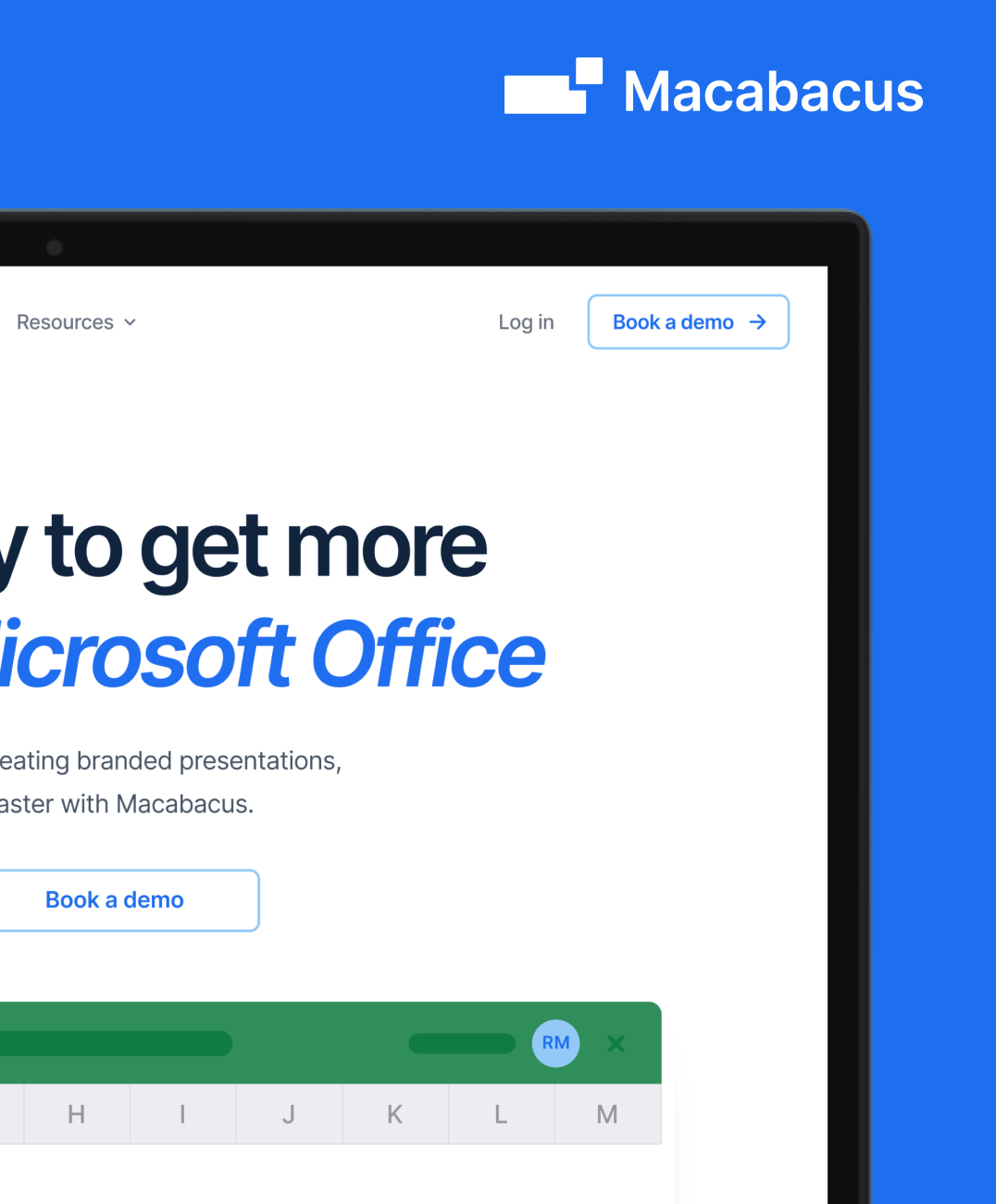

Hero Animations: Bringing Illustrations to Life
To enhance Macabacus’s website and create a compelling first impression, we developed dynamic hero animations that animate the static illustrations featured throughout the platform. These animations build upon the beautiful, illustrative style we designed, adding a layer of interactivity that brings the brand’s visual identity to life.
The hero animations showcase key features of Macabacus in action, offering users a dynamic preview of the platform’s capabilities. Each animation transitions smoothly, demonstrating core functionalities like Financial Modeling and Presentation Automation in a visually engaging manner. By animating the illustrations, we not only highlight the product’s benefits but also maintain a cohesive and modern aesthetic that aligns with the overall branding.
These animations are strategically crafted to captivate users’ attention, enhance their understanding of Macabacus’s features, and drive engagement from the moment they land on the site.
“They were able to take our directional vision and create something that was above and beyond our expectations.”

Press

Corporate Finance Institute (CFI) Announces Acquisition of Macabacus and Surpasses 4 Million Course Enrollments
LSEG Workspace Now Enhanced by Macabacus’ Productivity Tools
Product Services





The Results
80%
Productivity Increase
100k+
Professionals Using Product
1,560
Annual Workdays Saved
View the full website live here at macabacus.com

