Client
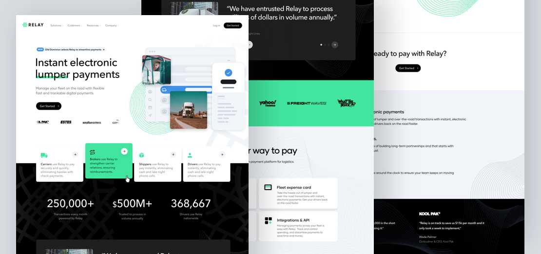
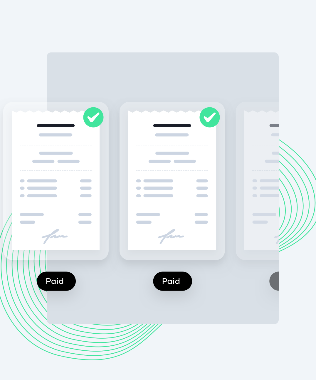
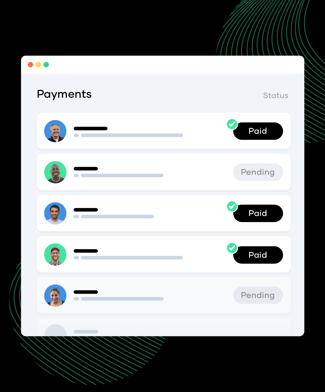
Relay is a modern payment platform powering supply chain and logistics. They do this by eliminating lengthy transactions on the dock, allowing for digital receipts and offering a real-time audit trail by removing cash and checks from the payment process.
Problem
Relay invited us to assist them in redesigning their desktop and mobile marketing site. They wanted a website that stood out against other competitors and incorporated flare and animation, while still feeling like a trustworthy and reliable supply chain. They encourage us early on to explore with different varieties that we first explored with the homepage banner area. Once we landed on a futuristic and modern aesthetic that the founders and team felt good running with we designed the rest of the homepage and the whole relaypayments.com website for both mobile and desktop.
Solution
We came up with a website for Relay that was both new and modern yet trustworthy and secure at the same time. The animations we’re not over-the-top, but had enough flare to make users feel exciting about scrolling more. We designed and branded the website to represents trustworthiness and security throughout each page on Relay.
Designing with trust and security in mind
When working with Relay we really wanted to stay within the boundaries of what a secure payment platform should look and feel like. We accomplished this by a few ways, due to of Relays customers and the amazing track record they have with some big time names such as Kool Pak, Coyote and other big players in the carrier space we wanted to showcase a slowly animated line of customer logos above the fold of the website so users familiar with the space would instantly know Relay is a trusted payment platform. We also added a few real quote from their customers right below the hero area from VPs and Senior Directors of the companies to showcase what the companies had to say about Relay.

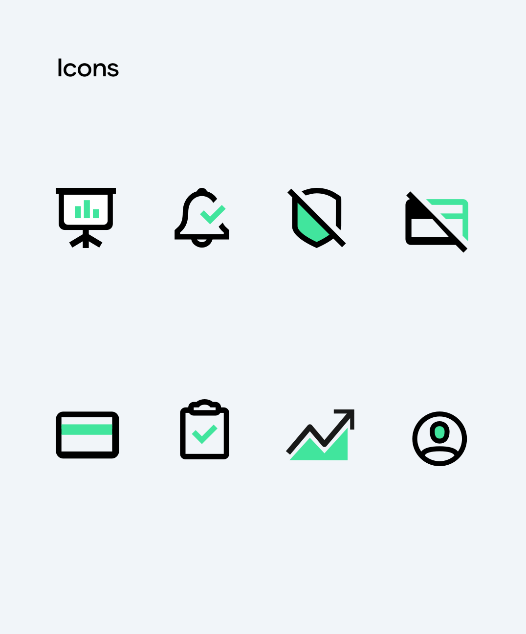
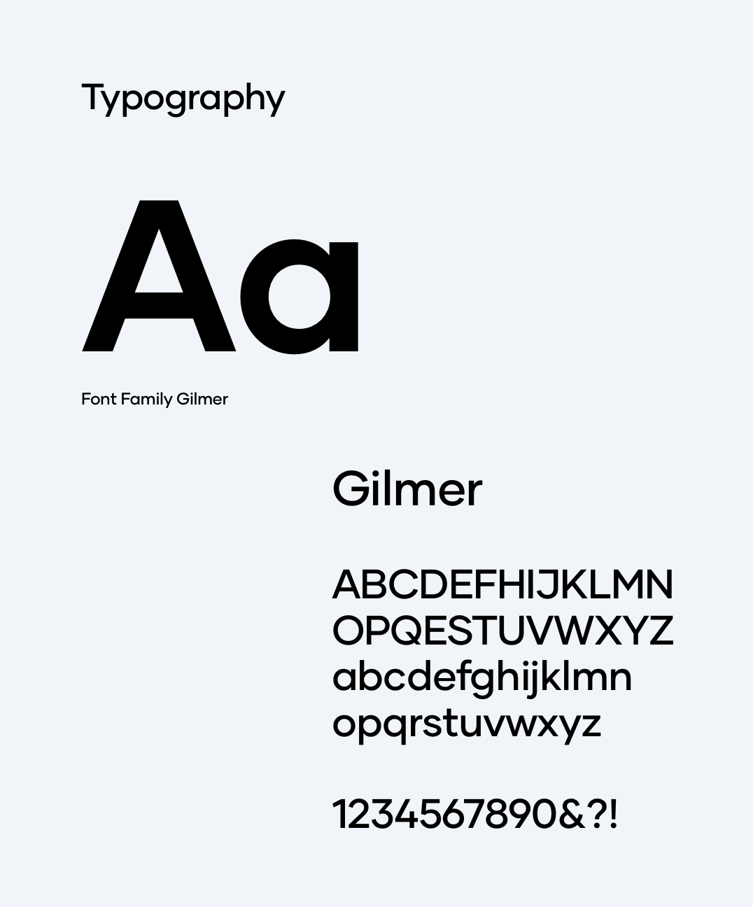
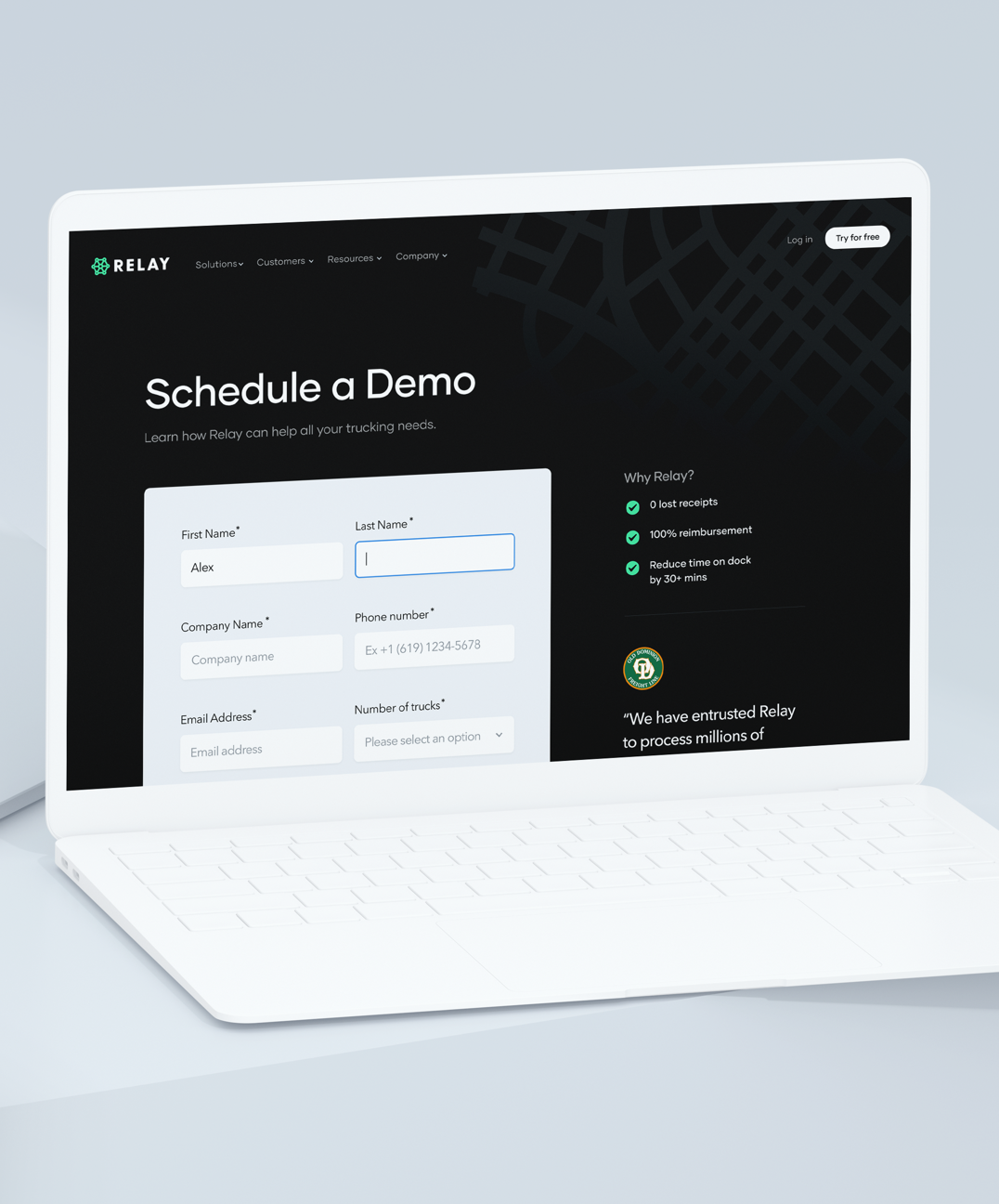
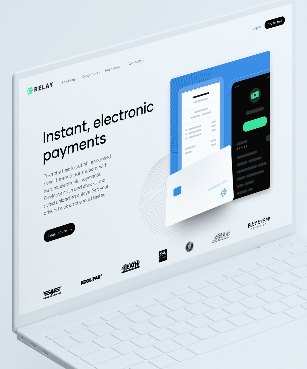
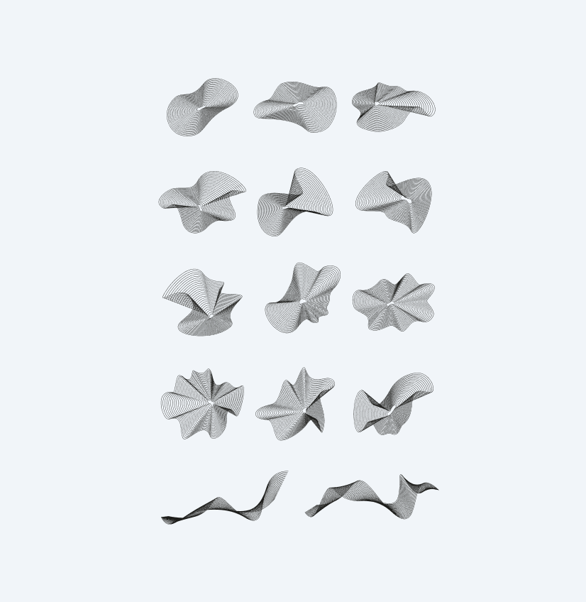
With the layout Relay wanted to go with, there was some blank spaces that needed to be filled throughout the website. We wanted to add a background element that would tell a story and help minimize the amount of empty space some of the section started to have as they grew. The ‘Relay Wave’ was inspired by roads from a birds eye view which from a trucking perspective was recognizable and also the formation of waves non-straight lines made the element feel liquid and represented flow which as a payment platform was important to incorporate.
Illustrations and imagery that tell a story
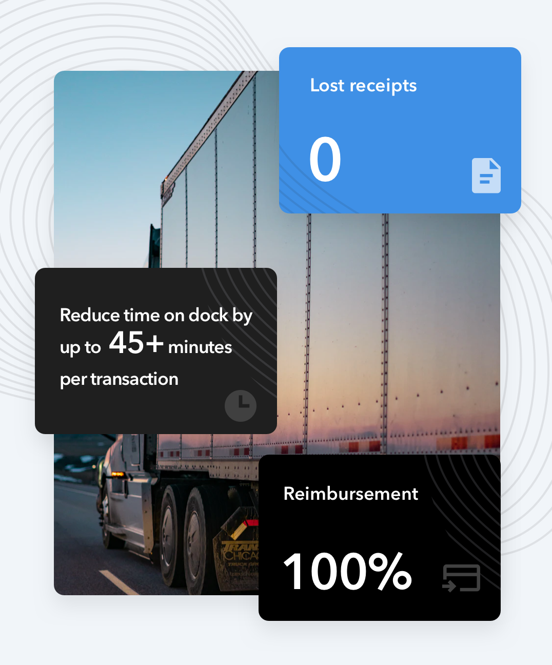
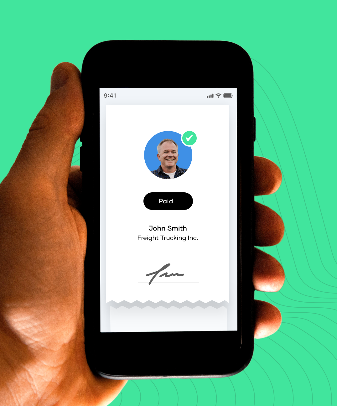
Due to the user demographic of the owners and operators who would potentially be using Relay we didn’t want to design with only youth in mind. It was important to have a mix of easy to comprehend illustrations and photos that told a story no matter which page you ended up on. This was thought-out early on in the website development stage and each photo was carefully hand picked from selected photography websites.

Great working with Caviar! Amazed with the result.

Press

“21 Top Startups to Watch in 2021”

Relay Payments, the fintech company modernizing payments for the supply chain, logistics, and trucking industries, has been named one of Inc. Magazine's Best Workplaces for the second consecutive year. The company was recognized for its outstanding culture, winning in the overall category as well as the "Prosperous and Thriving" and "Southeast Region" categories.

Relay Payments, the fintech company that modernizes payments for the supply chain, logistics and trucking industries, is being recognized as one of the most innovative companies in the freight industry with its debut onto the 2023 FreightTech 100 List.
Project services

The Results
$43M
In investment funding
250,000
Transactions every month
100+
Workforce across 12 states
