
An honest post about building a real client design system with Figma, Claude Code, and Claude Design, where AI came into play and I had to slow down and do it by hand.
Most posts about “AI design workflows” are demos. Everything works on the first try, the components are perfect, and you walk away feeling like you’re behind.
This is not that post.
I spent a week building a full design system for a client, with tokens, components, variants, the works, using Figma, Claude Code, and Claude Design together. It worked, but it wasn’t that simple. I want to walk through how the pieces fit, where the AI carried weight, and where I had to slow down and do the design by hand. If you’ve been curious about this process and want to be guided from start to finish, I’ll highlight that in this post.
1. The Setup: Three Tools, One Source of Truth
The stack was simple:
- Figma as the design source of truth. Variables, text styles, components – the place I actually make decisions.
- Claude Code as the bridge. It reads and writes my Figma file through the Figma MCP plugin, and generates the coded versions of components.
- Claude Design as the system layer. It turns the whole thing into a published, browsable design system with live components and brand voice.
The goal wasn’t “let AI design it for me.” It was “build a real system, with components, and use AI to kill the busywork between design, code, and documentation.”
2. Where the AI Actually Worked
A few things genuinely changed how fast I moved.
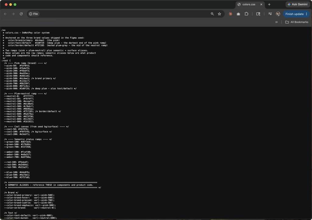
Token round-trips. I had Claude Code read my Figma file and write every variable out to clean CSS token files colors, spacing, radius, type, the full set. Then, going the other direction, it wrote tokens back into Figma as variables. Ninety-nine of them, in one pass. Doing that by hand is the kind of tedious that makes you cut corners. The AI just did it and it stopped to list what it was about to write before touching anything, which saved me from a couple of mistakes.
Component code from design. Once I’d built a button in Figma, Claude Code pulled the exact specs. Not approximations. The real 8px radius, the real Poppins Medium 14px, the exact disabled grays down to the hex. It didn’t guess and dim the colors, it read the actual values and matched them.
Documentation that writes itself. I built a small skill that attaches machine-readable metadata to each component, so the system knows how a Button is meant to be used, not just what it looks like. That metadata makes every future generation more accurate. Compounding returns.
When it worked, it felt like having a very fast, very literal Jr designer by my side.
It read the actual values and matched them.
3. Where I Had to Do the Work Myself
Here’s the part the demos skip.
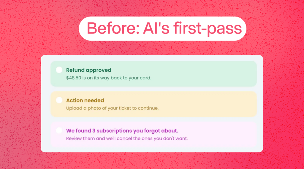
The AI’s first drafts were fine. Fine was not the bar. When I had Claude Design generate alert components, they came out acceptable, soft tinted backgrounds, a title, a description. But next to the badges I’d built by hand, they looked generic. The icons were empty placeholder dots. The whole thing read as unfinished.
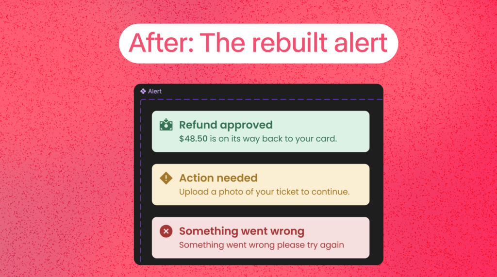
So I built the alerts myself. Same tokens, same semantic colors, but with filled-circle icons that matched my badges, real hierarchy, and one detail the AI kept missing: bolding the dollar amount inside the description so your eye lands on the money.
“$48.50 is on its way back to your card.” That bold number is the whole point of the message. A system should know that. I had to teach it.
The mechanics still bite. I lost a genuinely annoying chunk of time to one text style stuck in the wrong folder. In Figma, slashes in a style name create folders, and a rename kept stacking the path instead of replacing it. I ended up with a style buried in Body/Small/Body/Bold and could not get it out. Right-click wouldn’t fire. The rename field kept appending. The fix was dumb and human: delete it, make a fresh one, type the clean name once. No AI shortcut, just knowing the tool well enough to stop fighting it.
Taste is not delegable. The pattern kept repeating: the AI could produce something structurally correct, but the judgment calls stayed mine. Is this title bold enough? Is the line height too loose? Does this icon sit right against the text, or a hair too high? Should “New” be solid pink like the reference, or tinted to match the rest of the set? Because consistency across the system beat matching one reference. That’s a design decision. No model made it for me.
4. What to Hand Off and What to Keep
The whole system only looked like mine because I drew that line on purpose. Roughly:
| Hand to the AI | Keep by Hand |
| Reading/writing Figma variables to CSS tokens, both directions | Deciding the foundation — color, type, spacing |
| Pulling exact specs and generating component code | Building components and their visual hierarchy |
| Writing component metadata and documentation | Taste calls, weight, line-height, icon fit |
| Syncing 99 variables in one pass without errors | Knowing when “fine” isn’t good enough to ship |
5. The Actual Workflow, Step by Step
If you want to copy the pipeline, here’s the shape of it:
- Decide the foundation in Figma. Colors, type, spacing as variables and styles. You own this part completely. Get it right before anything else touches it.I had to design these from the ground up since we did nt have
- Let Claude Code sync tokens to code. One prompt, clean token files, both directions on demand. Don’t let it write blind — make it list changes first.
- Build components by hand in Figma. Yes, by hand. This is where your craft lives. The AI is faster at the plumbing, not the design.
- Push the file to Claude Design. It generates a published system — live components, brand voice cards, real screens you can test against.
- Generate component code with metadata. Now the coded versions come out matching your real specs, documented for the next person (or the next AI) who touches them.
The thing that makes it work is the order. Foundation and components are human. The connective tissue between design, code, and docs is where AI removes the friction.
6. What I’d Tell Another Designer
Use it. But use it like a power tool, not an autopilot.
The wins are real, and they’re not small. Token management, code generation, and documentation, the stuff that used to eat afternoons, now takes minutes. That time goes back into the work that actually matters.
But the system only looks like yours because I kept making the hard calls by hand. The AI gave me speed. It did not give me taste, and the moment I let “fine” ship, the quality dropped in a way I could feel immediately.
That’s the part no demo shows you.
Interested in budiling a design system for your product?
Get in touch. Lets connect: LinkedIn · Twitter/X