

Essential Analysis & Tactical Guide for Design Practitioners
In a fast-paced startup ecosystem, constraints are not barriers to creativity; rather, they are the primary parameters that determine a product’s success in the market. Balancing design idealism with technical and business realities is a daily challenge that every product designer must face.
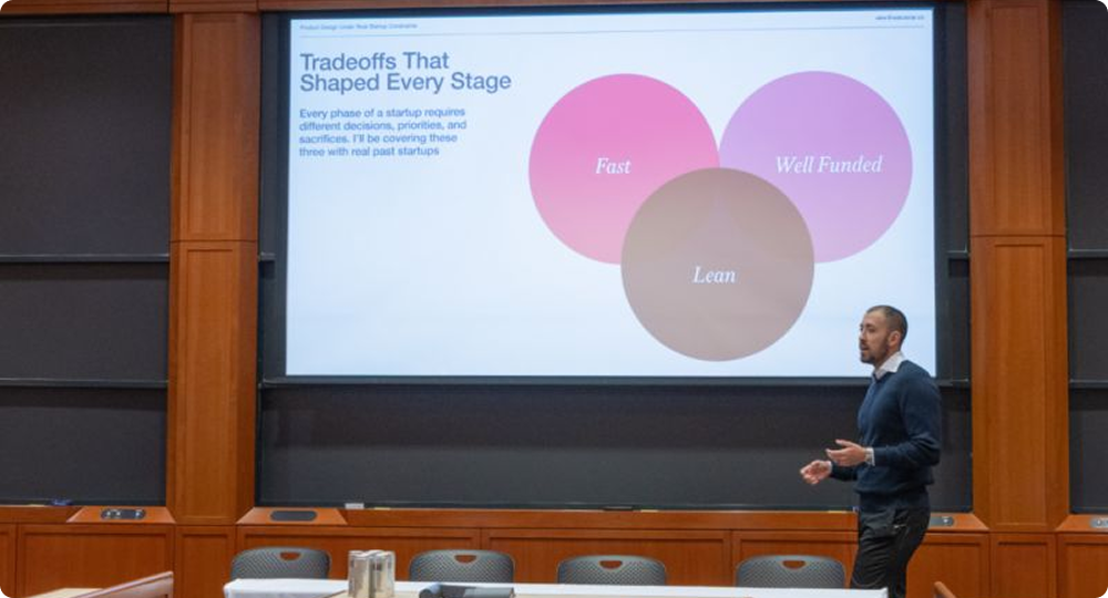
This article summarizes the crucial points from Alex Banaga’s presentation on managing product design constraints in a real-world startup landscape, ranging from time management to precise technical collaboration.
1. The Classic Dilemma: Speed vs. Quality
In the early stages of a startup, execution speed is often an absolute priority. Extremely tight deadlines require designers to move tactically. As a real-world example, a team might be given just six weeks to complete all visual aspects of a company: from branding and product design (UI/UX) to the official website.
When operating in a new space or an industry that lacks established references, designers cannot simply download or copy other existing social apps. The team is constantly challenged to come up with solutions on their own, make quick decisions, and ship the product without losing its core visual essence.
“Speed was top of mind here… we were constantly challenged to come up with answers on our own.” — A designer’s flexibility and intuition are truly tested when market references are highly limited and the clock is ticking.
2. Maintaining Design Consistency in the Production Pipeline
One of the biggest practical constraints is how the design is translated by the engineering team. In early-stage startups, the CTO (Chief Technology Officer) often acts directly as the one coding the product.
The moment a product component or logo is finalized, those assets are shipped immediately to the development team to be coded and pushed live (such as for the company’s LinkedIn environment, platforms, etc.). This instant workflow demands strict consistency to prevent any degradation of visual quality when the product launches.
3. Eliminating Engineer Guesswork Through Micro-Specifications
To ensure a smooth handover process without communication friction, design specifications must leave no room for guesswork for the software engineers. Micro-details become absolutely critical:
- Precise Typography: Designers must be specific not just about the font type and font weight, but also about the exact letter spacing and line height.
- Comprehensive Button Styles: Especially on a social platform, every button variation must be fully defined—including default, liked, and hover states. This applies to icon-only buttons, large buttons, and small buttons alike.
4. Overcoming Performance Bottlenecks Through Empty States
Technical constraints, such as page loading speeds, are a daily reality. When a product page needs to load multiple image assets (like JPEGs) simultaneously, application performance can slow down drastically.
A creative solution to bridge this constraint is optimizing alternative visual elements like ghost cards or empty state animations. Using a unique, animated illustration (for example, an animated cat napping or breathing on a laptop) can distract users from data loading wait times while boosting the product’s “delight” factor. However, executing such details must always be balanced against available budget constraints and access to specialized talent, like an animator or illustrator.
5. Balancing Customization and Scalability
Every design decision made early on must take the future into account. Will the visual identity and component architecture scale as the business grows? A brand and logo designed thoughtfully under startup pressure can successfully scale, remaining relevant and in use for years to come without requiring constant, total overhauls.
6. Designing Without References
One of the most underestimated constraints at an early-stage startup is the absence of industry precedent. Consumer fintech, B2B SaaS, and emerging category products all share one painful trait: there’s no obvious visual language to borrow from.
A practical 4-step approach when references don’t exist
- Anchor to the core action. What is the single thing this product must make effortless? Every visual decision flows from that.
- Borrow from adjacent industries. A logistics startup can draw from industrial design; a health app from editorial typography.
- Timebox visual exploration. Set a hard 48-hour limit for moodboards. Review with the team and commit.
- Ship and iterate. The first visual direction is a hypothesis, not a commitment. Treat it accordingly.
Design and engineering team reviewing screens
Weekly design–engineering sync at a startup studio in Berlin. Catching misalignments mid-sprint is far cheaper than fixing them in QA.
7. What a complete handoff actually includes
Every screen handed to engineering should cover all of the following states. Anything you don’t specify, a developer will decide — based on what’s easiest to build, not what’s best for the user.
- Happy path — the default, ideal user flow
- Empty state — first visit, no data, fresh account
- Error state — validation failures, network errors, server errors
- Loading state — skeletons, spinners, progress indicators
- Edge case — very long text, unusual data, extreme values
- Mobile breakpoint — at minimum 375px wide

8. Visual Coherence Under Pressure
Design systems exist to preserve visual consistency. But the classic approach — exhaustive component libraries, rigid tokens, lengthy documentation — is often a luxury you can’t afford in year one. The challenge is maintaining enough coherence to look credible without over-engineering your foundations.
The minimum viable design system
Four decisions, consistently applied, are enough to make a product feel intentional — even when it’s being built at breakneck pace.
| Decision | What to define | Needs tokens? | Priority |
|---|---|---|---|
| Type scale | 4–5 sizes, two weights, two fonts max | Yes | Day 1 |
| Color palette | Primary, secondary, 3 neutrals, error, success | Yes | Day 1 |
| Spacing unit | 4px or 8px grid — pick one and never deviate | Optional | Week 1 |
| Border radius | One value for cards, one for inputs, one for buttons | Optional | Week 1 |
| Shadow system | 2–3 elevation levels | Later | Month 2+ |
| Component library | Full Storybook / design system | Later | Series A+ |
9. When to Push Back — and When to Ship
Knowing when to advocate for better design and when to accept a constraint and move forward is perhaps the most important skill a startup designer develops. Push too hard and you become a bottleneck. Accept too much and the product accumulates design debt.
Donec quis erat non nunc porttitor consequat:
Facebook: https://www.facebook
Google: https://www.google
LinkedIn: https://www.linkedIn