Patlytics Branding
In our newest collaboration, we worked with Patlytics to refresh their brand guidelines. From logo, to palette, to font, we touched base with every important aspect of their brand. We are extremely happy with the final result and are excited to share more on our social media pages!
Other Insights
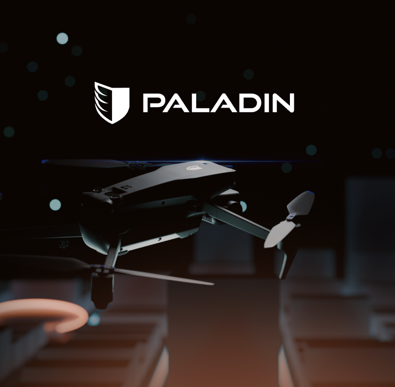
We recently had the pleasure of partnering with Paladin Drones to bring their vision to life online. Our team designed five engaging pages that capture the essence of their brand, infusing personality and clarity into every aspect of the site. From initial concept to final execution, we focused on crafting a digital experience that not only looks great but communicates the innovation and ambition behind their work. We’re excited to see how Paladin Drones continues to make an impact, and we're grateful to have played a part in their journey.
Read More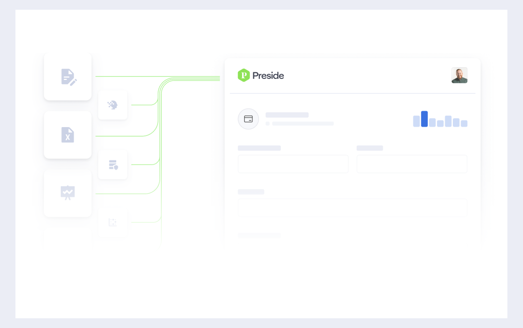
At Caviar, we’re proud to have designed Preside’s new website, a modular, intuitive, and affordable operations management system for Public Safety. The site features a dynamic homepage, comprehensive overview page, support section, and three engaging product pages. To enhance user experience, we also created a series of captivating hero animations that bring the platform to life. Discover how our innovative design elevates Preside's digital presence at usepreside.com.
Read More
The newly rebranded and redesigned Macabacus website is live. It was a pleasure to embark on this transformative journey, collaborating closely with the Macabacus team to redefine their brand identity and rebuild their digital presence. From crafting a modern visual language to developing engaging animations, icons and intuitive layouts, every aspect of the redesign reflects our shared vision of enhancing user experience. We’re excited for users to explore the fresh look and feel of Macabacus, which now beautifully embodies its commitment to excellence in finance and productivity tools.
Read More